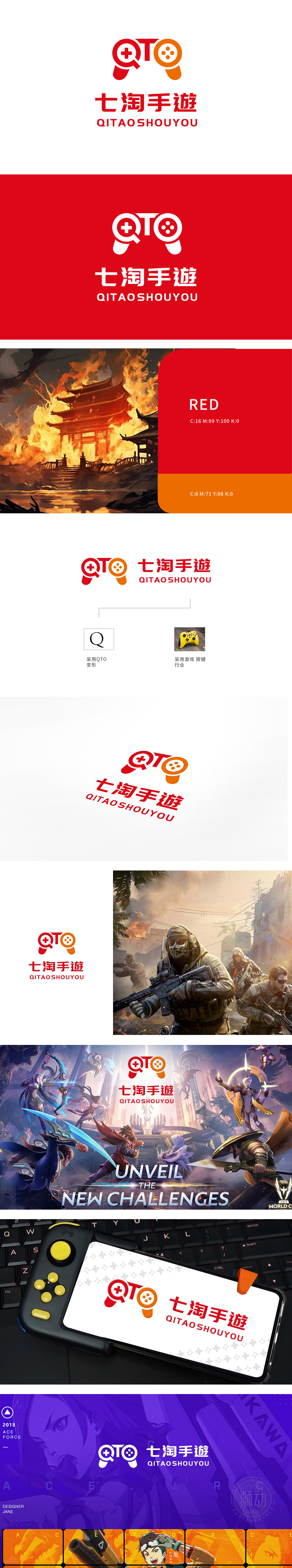
狮动设计将logo 的主体部分采用了游戏手柄的造型,手柄造型中嵌入了字母“QTO”,这是“七淘”的拼音首字母,巧妙地将品牌名称融入设计中。红色和橙色,这两种颜色鲜艳且具有活力,能够吸引眼球,传达出热情和动感,符合手游行业的特点。手柄造型直接表达了公司与游戏行业的紧密联系,突显了专业性和行业特色。将品牌名称与行业元素巧妙结合,展现出独特的设计思路。
Lion design adopts the shape of the game handle as the main part of the logo, and the letter "QTO" is embedded in the shape of the handle, which is the pinyin initials of "Qitao", skillfully integrating the brand name into the design. Red and orange, which are bright and energetic, can attract people's attention and convey enthusiasm and movement, which is in line with the characteristics of the mobile game industry. Handle modeling directly expresses the close relationship between the company and the game industry, highlighting the professionalism and industry characteristics.


扫码或拨打添加客服微信


