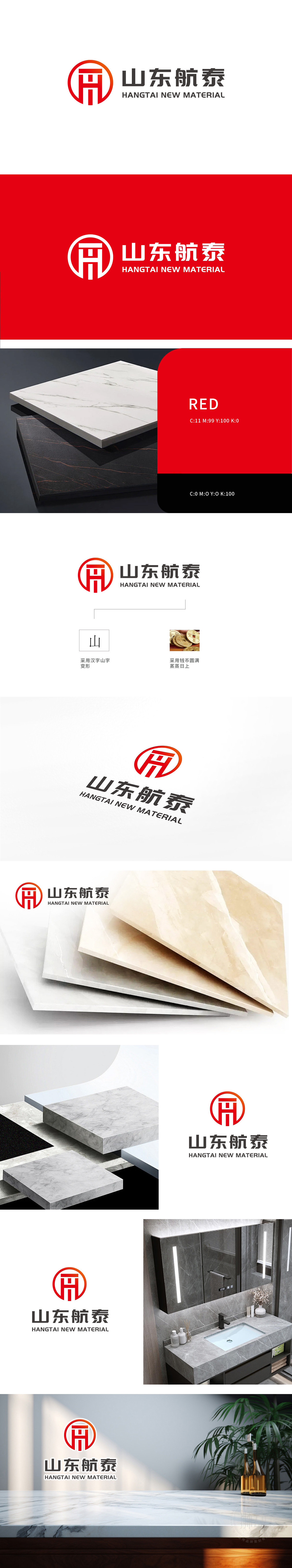
狮动设计将 Logo左侧的图形设计简洁有力,采用了红色和橙色渐变的圆形背景,内部嵌入了抽象的“H”字母造型。红色通常象征着热情、活力和创新,橙色则传递出温暖和积极的感觉,整体色调明亮,具有较强的视觉冲击力。“H”字母:作为公司名称“Hangtai”的首字母,既体现了公司的品牌标识,又通过其独特的设计(类似建筑结构的造型)暗示了公司在新材料领域的专业性和稳固性。抽象的建筑结构造型和稳重的字体设计,传达出公司在新材料领域的专业性和可靠性。
Lion design makes the graphic design on the left side of the Logo simple and powerful, adopts a circular background with gradual changes of red and orange, and embeds an abstract "H" letter shape inside. Red usually symbolizes enthusiasm, vitality and innovation, while orange conveys a warm and positive feeling, with bright overall tone and strong visual impact. "H" letter: As the initials of the company name "Hangtai", it not only embodies the company's brand identity, but also implies the company's professionalism and stability in the field of new materials through its unique design (similar to the shape of building structure).


扫码或拨打添加客服微信


