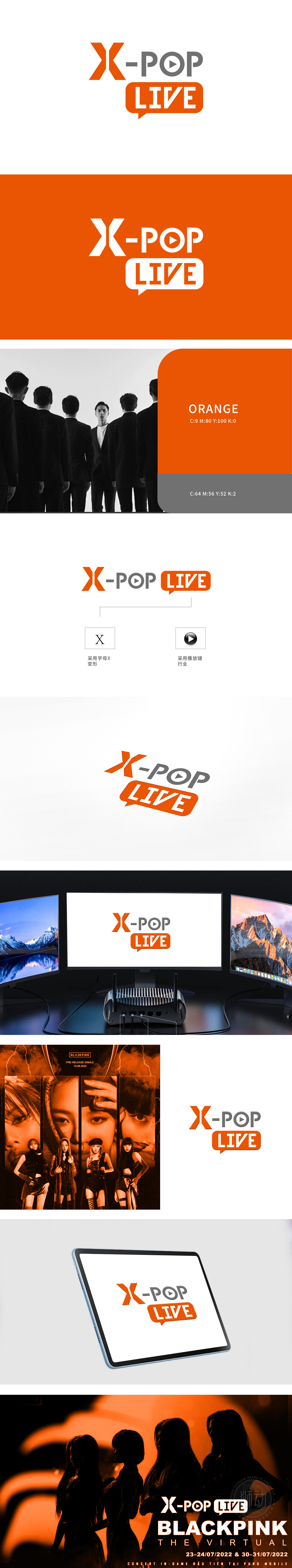
狮动在这款 logo 设计中展现出了对品牌业务属性的精准把握和出色的创意能力。“X”采用了橙色,形状独特且醒目,代表着未知、探索与创新,契合科技公司不断探索前沿领域的特质。POP”中的字母“O”里有一个播放按钮的图形,暗示着与数字内容、流媒体或动态信息相关,这与当下科技驱动的多媒体传播趋势相呼应,“LIVE”置于橙色的对话框形状中,橙色象征着热情、活力与互动,对话框则明确地传达出“实时、互动、交流”的概念,强调了即时性与用户参与感。简洁而富有深意的图形元素组合,既体现了科技公司的创新与专业,又通过色彩和图形巧妙地传达出业务特色(如互动、实时内容传播等)。这样的设计不仅具有极高的辨识度,还能在瞬间抓住受众的目光并传达出品牌的核心价值。
In this logo design, Lion Motion has demonstrated its precise grasp of brand business attributes and excellent creative ability. The "X" is orange, which is unique and eye-catching, and may represent the unknown, exploration and innovation, which is in line with the characteristics of technology companies constantly exploring frontier fields. The letter "O" in "POP" has a graphic of a play button, implying that it is related to digital content, streaming media or dynamic information, which echoes the current trend of multimedia communication driven by technology. "LIVE" is placed in an orange dialog box shape, which symbolizes enthusiasm, vitality and interaction, and the dialog box clearly conveys the concept of "real-time, interaction and communication", emphasizing immediacy and user participation.


扫码或拨打添加客服微信


