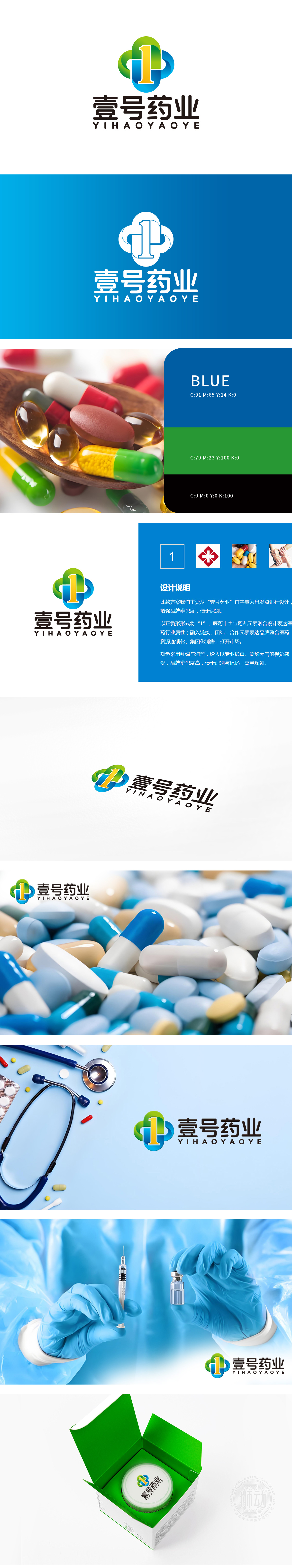
狮动设计团队采用四叶草形状,四个圆形部分环绕数字“1”,形成类似四叶草的图案。四叶草通常象征着健康、幸运和自然,这与药业公司的行业属性高度契合,传达出健康和福祉的理念。绿色,代表自然、健康和生命,符合药业公司的行业特性。蓝色,象征信任、专业和科技,增强品牌的可靠性和现代感。橙色,增加视觉冲击力,传达活力和温暖,吸引客户关注。四叶草和绿色元素强调健康和自然,蓝色则体现专业和科技,整体设计贴合药业行业的特性。设计充分考虑了药业行业的特性,通过视觉元素成功传达出健康、专业和科技的品牌形象。
The lion design team adopts a four-leaf clover shape, and four circular parts surround the number "1" to form a pattern similar to a four-leaf clover. Four-leaf clover usually symbolizes health, luck and nature, which is highly consistent with the industry attributes of pharmaceutical companies and conveys the concept of health and well-being. Green, representing nature, health and life, conforms to the industry characteristics of pharmaceutical companies. Blue symbolizes trust, professionalism and technology, and enhances the brand's reliability and modernity. Orange increases visual impact, conveys vitality and warmth, and attracts customers' attention.


扫码或拨打添加客服微信


