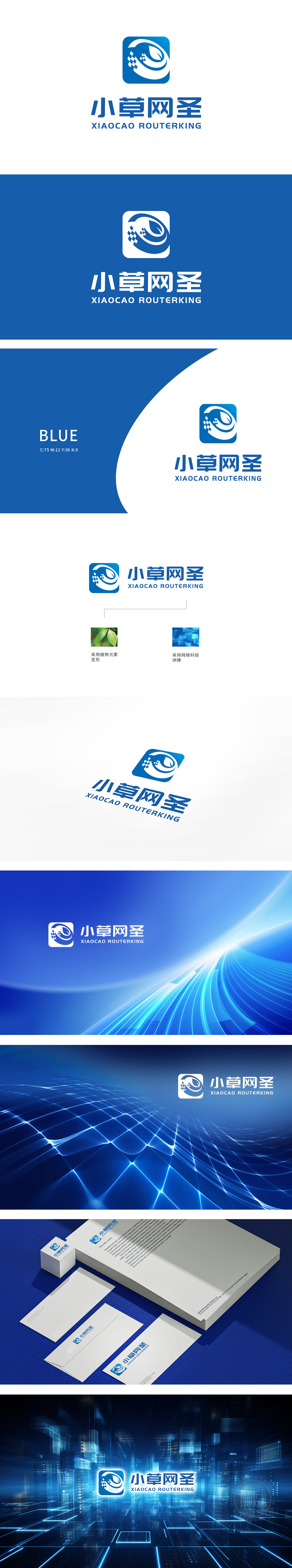
狮动设计由白色图案融合了叶子和波浪的元素,左侧点缀着类似像素风格的图案。颜色选择主要采用蓝色和白色,蓝色象征科技、信任和专业,白色则代表纯净和简洁。设计风格整体设计简洁现代,具有较强的辨识度。波浪元素则象征网络的流动性和广泛覆盖。蓝色的科技感与叶子的亲和力相结合,既体现了公司的技术实力,又拉近了与用户的距离,高效网络服务的价值观.
The lion-moving design combines the elements of leaves and waves with a white pattern, and the left side is dotted with patterns similar to pixel style. Color selection mainly adopts blue and white, blue symbolizes technology, trust and professionalism, while white represents purity and simplicity. Design style The overall design is concise and modern, with strong identification. The wave element symbolizes the mobility and wide coverage of the network.


扫码或拨打添加客服微信


