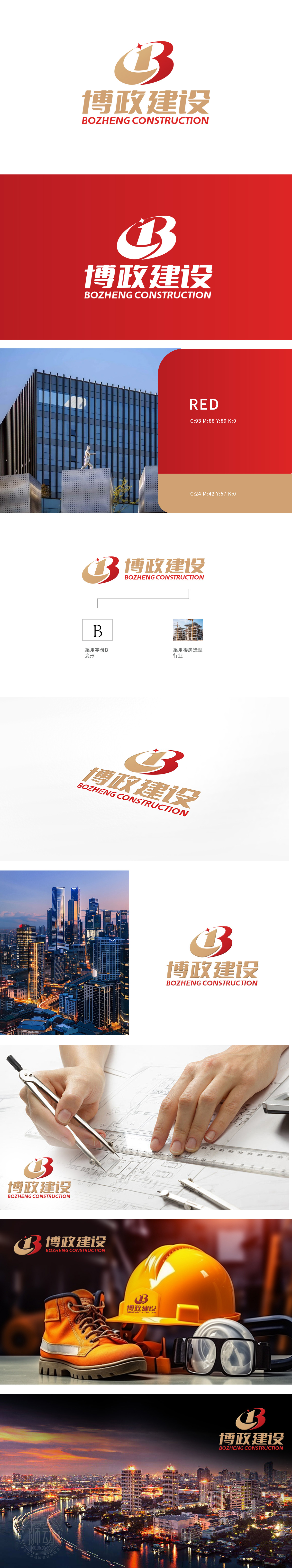
狮动设计以字母“B”为视觉核心,通过红金双色切割构成立体感造型,既呼应品牌名称“博政建设”(首字母“B”强化品牌记忆点),又暗含建筑结构的稳定与力量感。红色 象征活力、创新与行业领导力,传递企业进取精神;金色 代表权威、品质与信任,契合城市建设领域的专业形象, 顶部红色五角星不仅是装饰,更寓意“引领行业标杆”的愿景,提升LOGO的精神高度设计紧扣城市建设领域的“可靠、创新、前瞻”核心价值;精准捕捉“专业建设者”与“行业引领者”双重定位 将抽象理念转化为可感知的视觉符号;
Lion design takes the letter "B" as the visual core, and forms a three-dimensional modeling through red and gold two-color cutting, which not only echoes the brand name "Bozheng Construction" (the initial letter "B" strengthens the brand memory point), but also implies the stability and strength of the building structure. Red symbolizes vitality, innovation and industry leadership, and conveys the enterprising spirit of enterprises; Gold represents authority, quality and trust, which fits the professional image in the field of urban construction. The red five-pointed star at the top is not only a decoration, but also implies the vision of "leading the industry benchmark", enhancing the spirit of LOGO.


扫码或拨打添加客服微信


