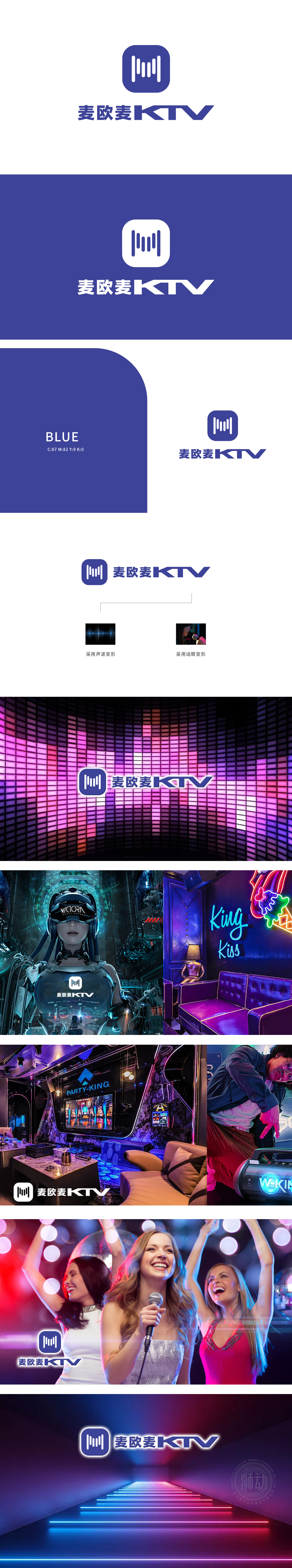
狮动设计以一个深蓝色的方形图标和下方的“麦欧麦KTV”字样组成。方形图标内部有五条竖直的白色线条,线条长度不一,形成一种音波或音乐节奏的视觉效果,象征着KTV的核心功能——音乐与歌唱。通过简洁而具有音乐元素的图标设计,强化品牌与音乐、娱乐的关联,提升品牌识别度。图标和字体的简洁设计,使得Logo在各种应用场景中都能保持清晰和美观,吸引客户的注意力。
Lion design consists of a dark blue square icon and the words "Mai Ou Mai KTV" below. There are five vertical white lines in the square icon with different lengths, forming a visual effect of sound wave or music rhythm, which symbolizes the core functions of KTV-music and singing. Through simple and musical icon design, the relationship between brand and music and entertainment is strengthened, and brand recognition is enhanced. The simple design of icons and fonts makes .


扫码或拨打添加客服微信


