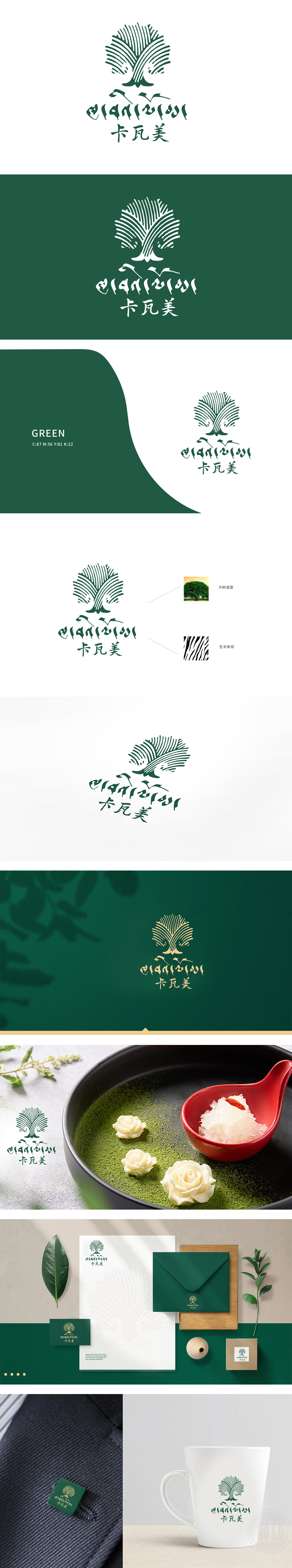
狮动设计主体以抽象化的“大树”为造型基础,线条如枝叶般向外舒展辐射,象征品牌如树木般扎根深厚、蓬勃生长,传递“自然、健康、滋养”的餐饮理念。曲线纹理细腻交织,暗喻品牌对产品品质的匠心追求。主色选用鲜活的绿色,呼应“大树”主题,直观传达食材新鲜、环境自然的品牌特质,引发消费者对健康饮食的联想,共同传递“温暖、安心、美好”的用餐体验承诺,强化品牌与消费者之间的情感联结。巧妙嫁接藏文元素,平衡商业性与文化尊重,为品牌打造独特故事性,提升市场差异化竞争力。好的设计不是装饰,而是品牌战略的视觉化表达。
The main body of Lion Dance design is based on the abstract "big tree", and the lines radiate outward like branches and leaves, which symbolizes that the brand is deeply rooted and thrives like a tree and conveys the catering concept of "nature, health and nourishment". The curves and textures are finely interwoven,It is a metaphor for the brand's ingenious pursuit of product quality. The main color is fresh green, echoing the theme of "big tree", intuitively conveying the brand characteristics of fresh ingredients and natural environment, triggering consumers' association with healthy eating and jointly conveying.


扫码或拨打添加客服微信


