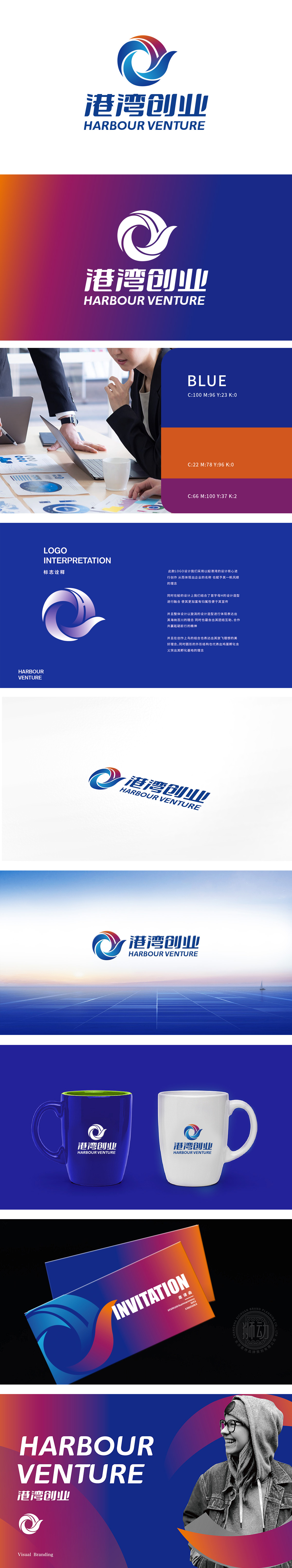
狮动设计主体采用海浪或风帆,传达出一种动感和前进的力量,寓意公司在创业道路上勇往直前乘风破浪。色彩选择蓝色代表稳定、信任和专业,橙色则象征活力、创新和热情。两种颜色的渐变融合,既体现了公司的专业性和可靠性,又展现了其创新和活力。曲线设计给人以柔和、流畅的视觉感受,象征着公司业务的顺畅发展和灵活应对市场变化的能力。Logo传达出公司致力于为创业者提供广阔平台和有力支持的核心价值,如同港湾为船只提供避风港一样,为创业者提供安全、稳定的创业环境。
The main body of Lion Motion design adopts waves or sails, which conveys a dynamic and progressive force, implying that the company will go forward bravely and ride the wind and waves on the road of entrepreneurship. Blue represents stability, trust and professionalism, while orange symbolizes vitality, innovation and enthusiasm. The gradual fusion of the two colors not only reflects the professionalism and reliability of the company, but also shows its innovation and vitality.Curve design gives people a soft and smooth visual feeling.


扫码或拨打添加客服微信


