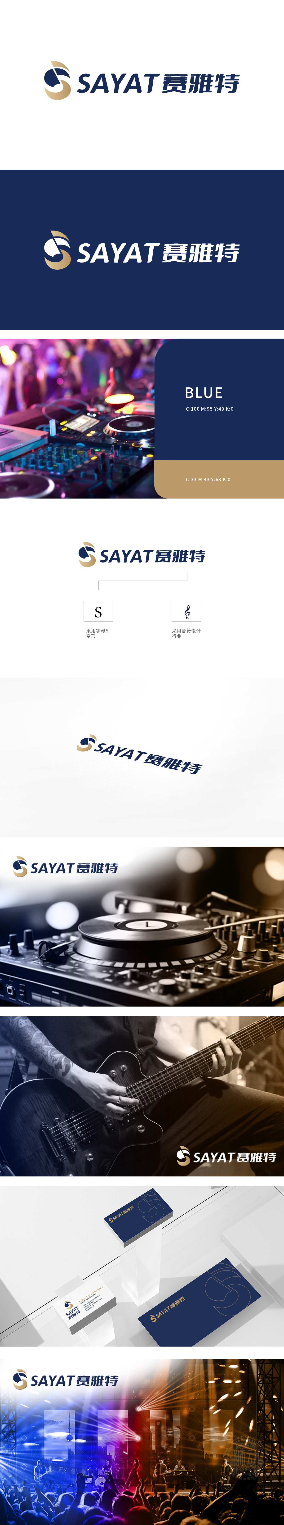
狮动设计以抽象「S」字母为基底,巧妙融入音乐音符的流畅线条,右侧弧形如声波般传递活力,暗含演唱会现场的动感与热情,直击音乐/娱乐行业的核心场景,强化品牌行业属性。?色彩与图形的战略布局:深蓝(专业/沉稳)与浅棕(活力/奢华)碰撞,形成视觉张力,既展现品牌的可靠性,又似舞台灯光的璀璨,用数据驱动设计决策,确保每个作品都能「被看见,更被记住」。
The Lion Movement team conducted in-depth research on the industry trends and brand concepts, with vibrant orange as the main color, created an embarrassing cartoon bear image, and held a spoon to convey the pleasure of dining. Innovative use of "auspicious | food | bear" separate design, with pinyin to strengthen recognition. Simple and bright visual language fits the light food track accurately, and customers are full of praise for the design ability of Lion Motion's "strategy+creativity" dual drive, calling "this is the soul of our new brand"!


扫码或拨打添加客服微信


