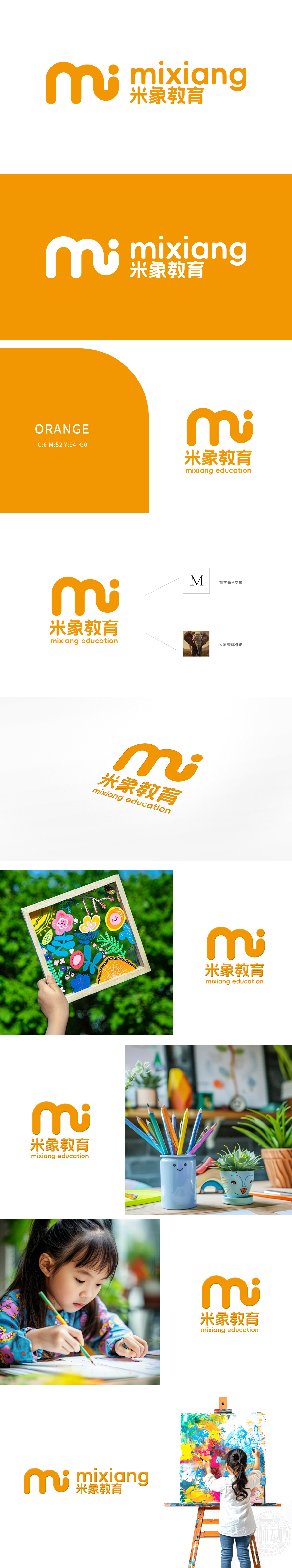
狮动设计以左侧的“mi”图形设计采用了流畅的线条和简洁的笔画,形态上类似于“米”字的抽象化表达,同时融入了象形的创意,象征教育的智慧和灵动。色彩选择采用橙色为主色调,橙色通常给人以活力、温暖和积极的感觉,符合教育行业的正面形象。Logo通过简洁而富有创意的笔画,传达了“米象教育”致力于提供高质量、创新教育服务的品牌理念。
Lion Dance Design adopts smooth lines and simple strokes with the "mi" graphic design on the left, which is similar to the abstract expression of the word "mi" in form, and at the same time incorporates pictographic creativity, symbolizing the wisdom and agility of education. The main color is orange, which usually gives people a feeling of vitality, warmth and positivity, and conforms to the positive image of the education industry.


扫码或拨打添加客服微信


