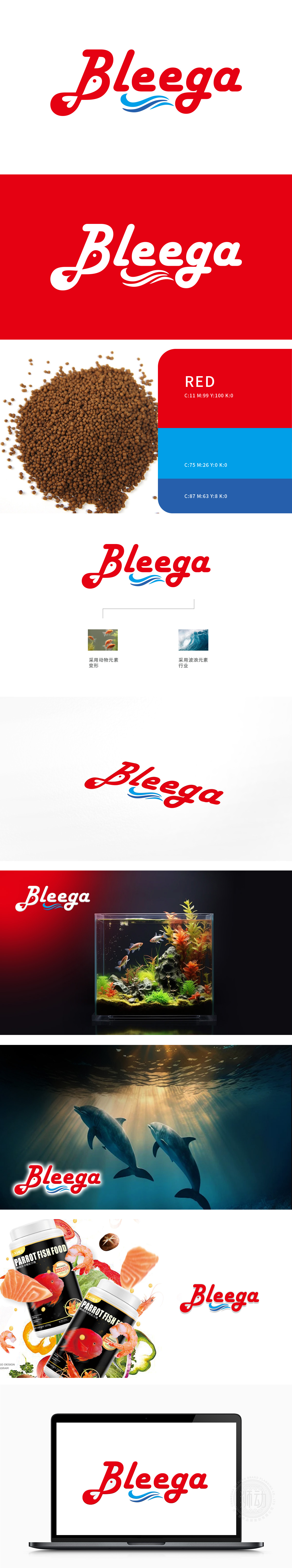
狮动设计以e”字母下方的蓝色波浪图案,象征着水或海洋,强化了品牌与鱼食的关联性。蓝色与红色的搭配不仅视觉上和谐,还增强了品牌的辨识度和吸引力整体设计简洁而不失创意,美学创新让logo在众多文化符号中脱颖而出。
Lion design uses the blue wave pattern under the letter "E" to symbolize water or ocean, which strengthens the relationship between the brand and fish food. The combination of blue and red is not only visually harmonious, but also enhances the recognition and attractiveness of the brand. The overall design is simple and creative.


扫码或拨打添加客服微信


