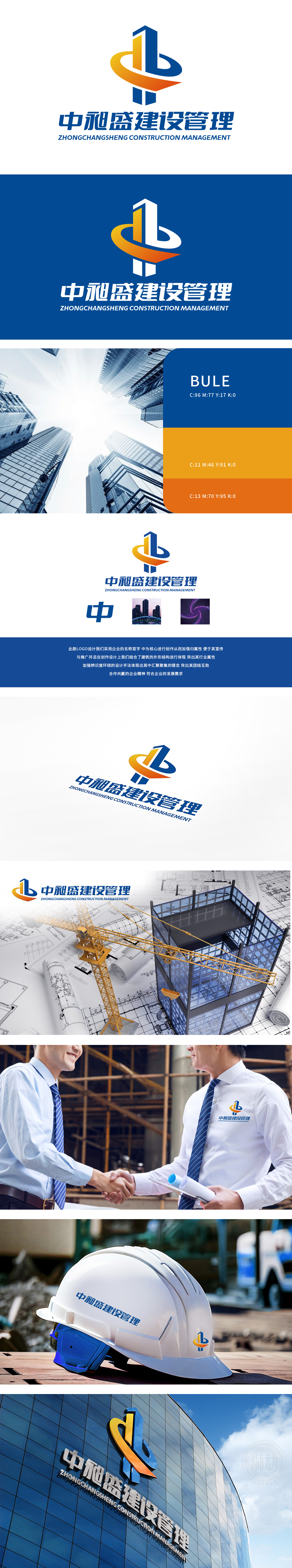
狮动设计以Logo中央的图形部分,左侧形似一栋高楼,采用蓝色和黄色渐变色块,象征着建筑的稳固与现代化。右侧的蓝色弧线则像是一条飘带或建筑的曲线结构,整体设计传达出建筑行业的专业性和创新性。独特的建筑元素与流畅线条的结合,体现了狮动在设计上的创新思维,能够吸引寻求创新设计风格的客户。
The lion movement design takes the graphic part in the center of the Logo, and the left side looks like a tall building, with blue and yellow gradient blocks, symbolizing the stability and modernization of the building. The blue arc on the right is like a ribbon or a curved structure of a building, and the overall design conveys the professionalism and innovation of the construction industry. The combination of unique architectural elements and smooth lines reflects the innovative thinking of Lion Motion in design and can attract customers seeking innovative design styles.


扫码或拨打添加客服微信


