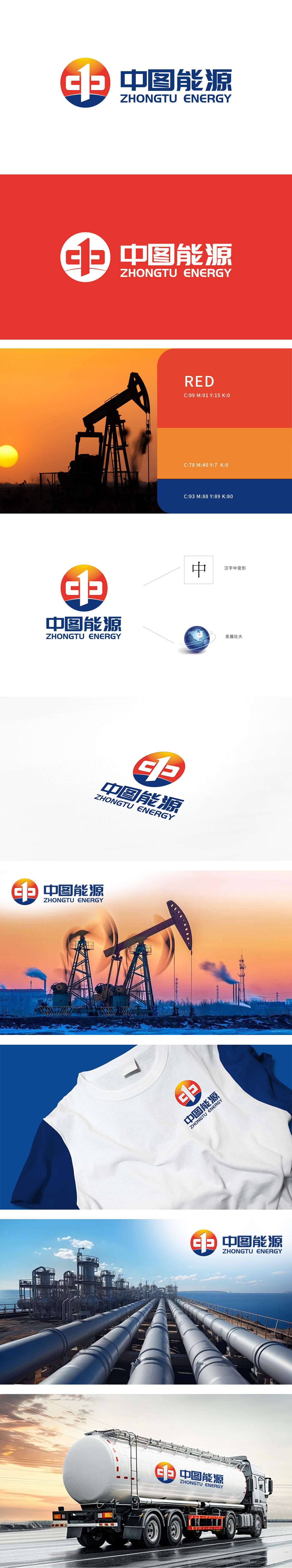
狮动设计以“C”与“T”组合:Logo中的图形部分巧妙地将字母“C”和“T”结合,代表“中图”的首字母,设计独特且具有辨识度。红色和黄色常用于表示能源的热烈与活力,蓝色则象征着科技与稳定。现代感与专业性简洁的图形和字体设计,体现出公司在石油开采领域的现代化技术和专业服务。不仅视觉冲击力强,还传递出能源行业的稳健与可靠。
Lion design combines "C" and "T": the graphic part of Logo skillfully combines the letters "C" and "T" to represent the initials of "Chinese picture", which is unique and recognizable. Red and yellow are often used to express the enthusiasm and vitality of energy, while blue symbolizes technology and stability. Modern and professional concise graphic and font design reflects the company's modern technology and professional services in the field of oil exploitation.


扫码或拨打添加客服微信


