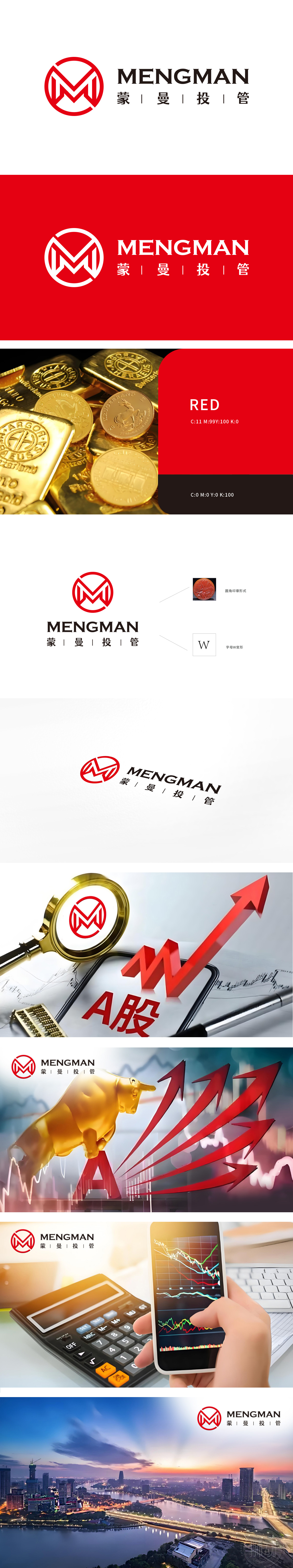
狮动设计采用了Logo的核心图形是一个红色的圆形变形字母“M”:巧妙融合了金融元素,线条流畅,展现出品牌的独特性和专业性。象征财富(Wealth)或双赢(Win-Win),适合金融行业的创新和合作理念。整体设计简洁而富有现代感,传达出专业与稳重的品牌形象。圆角印章形式的设计,增强品牌的正式性和权威性,整体设计简洁而富有现代感,传达出专业与稳重的品牌形象。
Lion design adopts the Logo, the core graphic of which is a red circular deformed letter "M": it skillfully combines financial elements, and the lines are smooth, showing the uniqueness and professionalism of the brand. Symbolizing Wealth or Win-Win, it is suitable for the innovation and cooperation concept of the financial industry. The overall design is simple and modern, conveying a professional and steady brand image. The design of fillet seal form enhances the formality and authority of the brand, and the overall design is concise and modern, conveying a professional and stable brand image.


扫码或拨打添加客服微信


