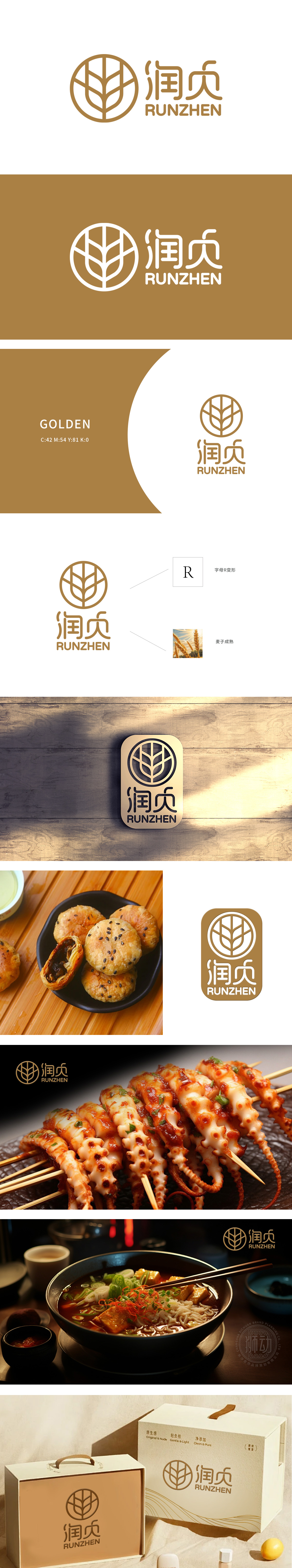
狮动设计以图形中的麦穗设计巧妙地融入了字母“R”的形态,这是“润贞”拼音“RUNZHEN”的首字母,体现了设计的巧妙和品牌识别性。Logo的图形部分采用了圆形设计,内部融合了麦穗的元素,象征着丰收和自然,行业属性突出,展现了狮动在品牌标识设计上的创新思维与专业技艺。简洁而富有深意的图形,搭配优雅的中英文文字,整体设计既现代又不失传统韵味,充分体现了狮动在Logo设计领域的卓越能力。
Lion design skillfully incorporates the shape of the letter "R" with the wheat ear design in the graphic, which is the first letter of "RUNZHEN" pinyin "Runzhen", which embodies the ingenuity of design and brand recognition. The graphic part of Logo adopts a circular design, and the elements of wheat ears are integrated inside, which symbolizes harvest and nature, and the industry attributes are outstanding, showing the innovative thinking and professional skills of Lion Sports in brand logo design.


扫码或拨打添加客服微信


