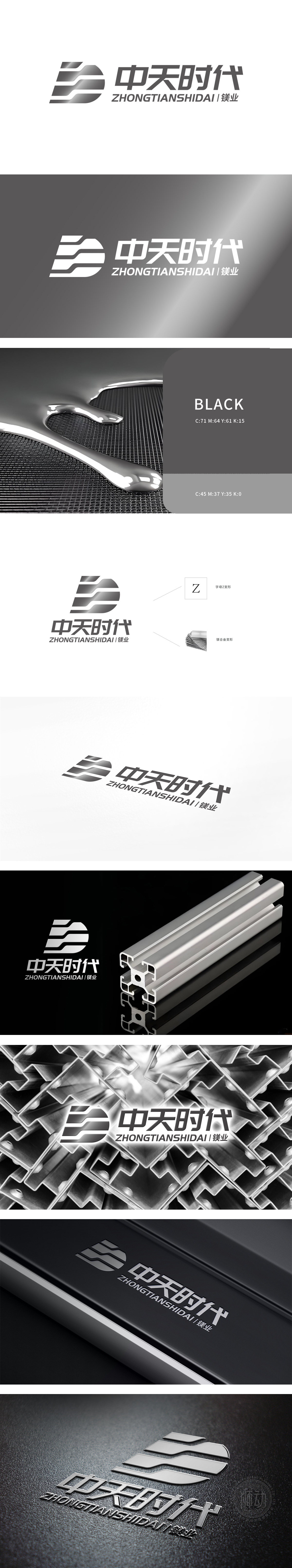
狮动设计为Logo图形由两个平行的、带有渐变效果的条形元素组成,来源于镁合金的特性,如轻质、高强度,整体形状字母“Z”的变形,象征着动态、前进和变革。Logo设计融入“镁合金变形”的概念,直接关联公司的业务领域,体现专业性和行业特色。渐变色的使用增加了视觉层次感,使Logo更具现代感和立体感。
Lion design is that the Logo graphic consists of two parallel strip elements with gradual effect, which comes from the characteristics of magnesium alloy, such as light weight and high strength, and the deformation of the whole shape letter "Z", which symbolizes dynamics, progress and change. Logo design integrates the concept of "magnesium alloy deformation", which is directly related to the company's business field and reflects professionalism and industry characteristics. The use of gradient color increases the visual layering and makes the Logo more modern and stereoscopic.


扫码或拨打添加客服微信


