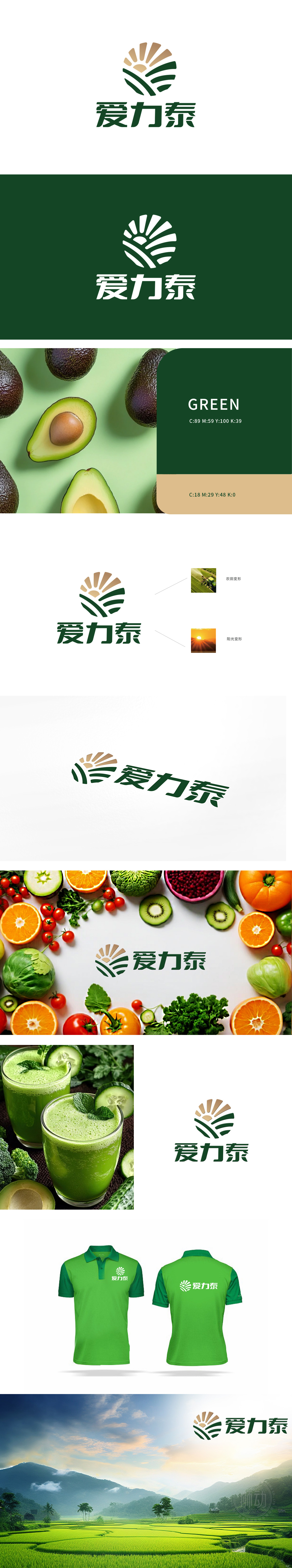
狮动设计采用的放射状图案:类似太阳光芒,象征光明、希望和能量。绿色线条:形似农田或植物的抽象表现,传达自然、生态和农业的意象,直观传递“阳光滋养大地”的农业本源意象,象征自然能量与丰收的期待。动态线条与阳光图形,传递“进取、赋能”的品牌精神,狮动通过符号化自然元素、具象化产业场景与色彩情感调控,构建了高度契合客户需求的logo系统。
The radial pattern used in the lion design: similar to the sun's light, symbolizing light, hope and energy. Green line: it looks like an abstract expression of farmland or plants, conveys the images of nature, ecology and agriculture, intuitively conveys the agricultural origin image of "sunshine nourishes the earth", and symbolizes natural energy and the expectation of bumper harvest. Dynamic lines and sunshine graphics convey the brand spirit of "enterprising and empowering".


扫码或拨打添加客服微信


