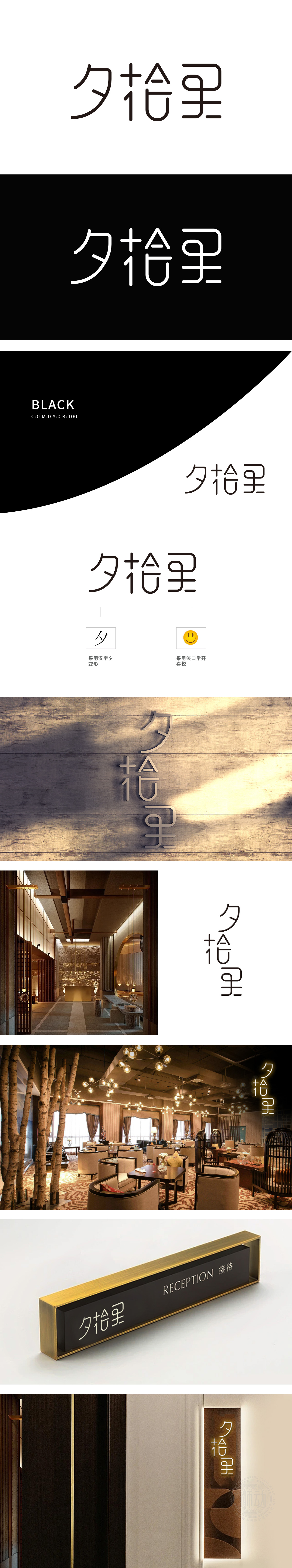
狮动设计采用夕”字保留了汉字结构,通过线条的流畅化处理,使其更具现代感与艺术性,为餐饮定位注入时间维度与氛围感。标志中最引人注目的“拾”字被创意性地设计为笑脸图形。眼睛与嘴巴的线条简洁生动,直接传递“喜悦、温暖”的情感。这种将文字与表情符号结合的创意,既保留了“拾”字的识别度,又以视觉化方式强化了品牌的核心理念——为顾客带来愉悦的用餐体验。通过汉字变形、情感化图形、色彩搭配等手法,精准捕捉餐饮行业核心需求,既传递了“温馨、愉悦”的品牌特质.
The lion dance design adopts the word "Xi" to retain the structure of Chinese characters, and through the smooth processing of lines, it is more modern and artistic, injecting time dimension and atmosphere into the positioning of catering. The most striking word "pick up" in the logo is creatively designed as a smiley face graphic. The lines of eyes and mouth are simple and vivid, which directly convey the feelings of "joy and warmth". This creative idea of combining words with emoticons not only retains the recognition of the word "Shi".


扫码或拨打添加客服微信


