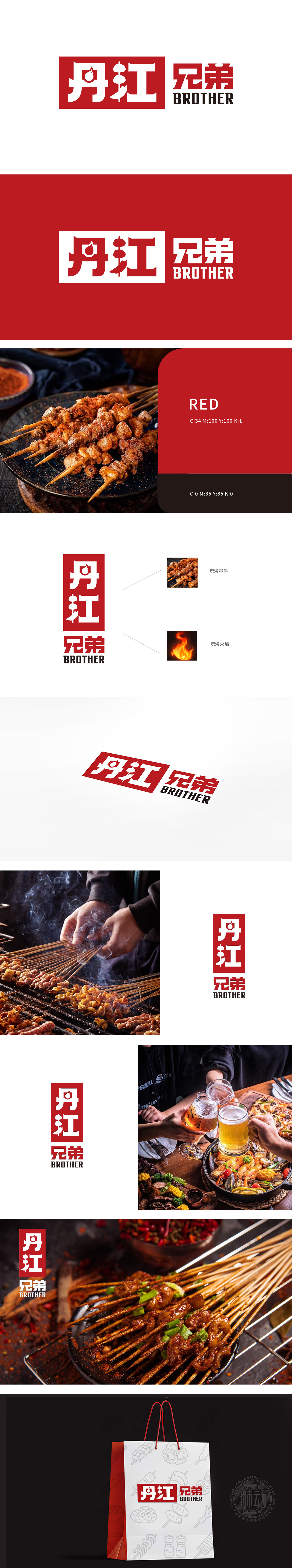
狮动设计采用了“丹江兄弟”四个字,其中“丹”和“江”字融入了火焰和串串的图形元素,直接关联到烧烤主题,使品牌定位清晰颜色选择:红色背景搭配白色文字,传达出热情、活力的感觉,符合烧烤文化的热烈氛围。字体设计:字体粗犷有力,具有强烈的视觉冲击力,易于识别和记忆。通过热情的色彩和生动的图像,激发顾客对美食的渴望,产生情感共鸣,提升品牌吸引力。
The Logo used in the lion dance design adopts the word "Dan Jiang Brothers", in which the words "Dan" and "Jiang" are integrated with the graphic elements of flames and strings, which are directly related to the barbecue theme, making the brand positioning clear.Color selection: red background with white characters conveys the feeling of enthusiasm and vitality, which is in line with the warm atmosphere of barbecue culture. Font design:the font is rough and powerful, with strong visual impact and easy to identify and remember.


扫码或拨打添加客服微信


