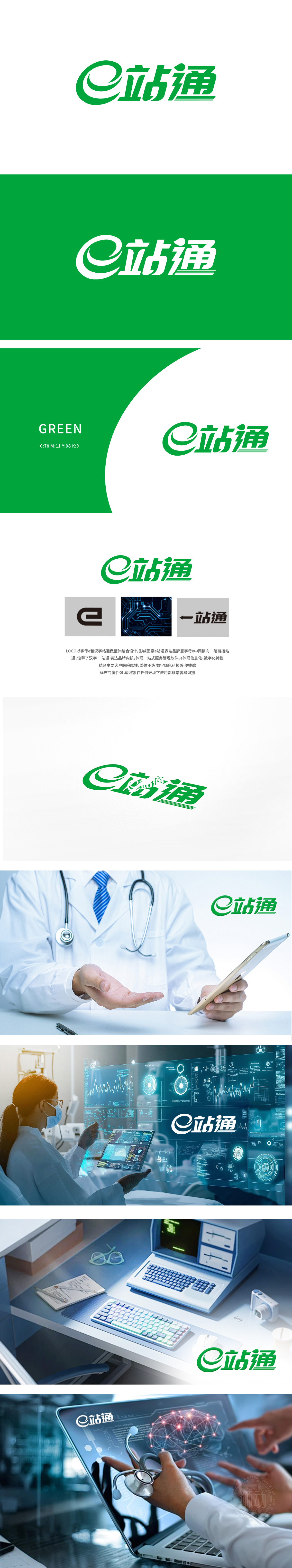
设计以字母“e”和汉字“站通”结合设计,形成独特的图案。字母“e”:中间横向一笔链接,象征信息化和数字化特性。颜色选择:绿色为主色调,传达绿色科技感和便捷感,狮动以科技美学为内核,通过精准的符号语言与逻辑架构,将“一站式服务管理软件”的抽象概念转化为极具未来感的视觉系统,为客户构建出高效、智能且极具辨识度的品牌印象。
Lion design combines the letter "E" with the Chinese character "Station Pass" to form a unique pattern.Letter "e": a horizontal link in the middle, symbolizing the characteristics of informationization and digitalization. Color selection: green is the main color, conveying the sense of green technology and convenience. Lion Motion takes the aesthetics of science and technology as the core, and transforms the abstract concept of "one-stop service management software" into a futuristic visual system through accurate symbolic language and logical architecture.


扫码或拨打添加客服微信


