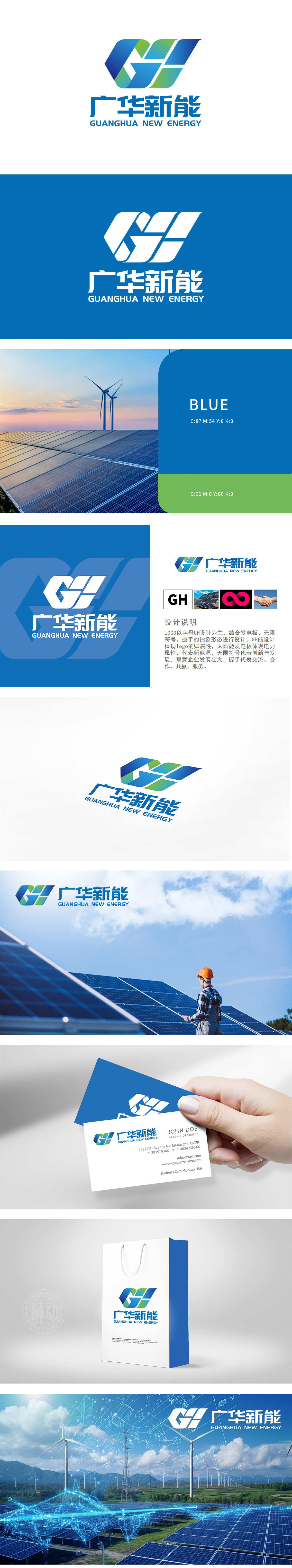
狮动设计以锐利线条构建的“GH”字母组合,采用立体切割效果与渐变光影,突破传统字体束缚,呈现精密仪器的科技质感。将科技基因与品牌内核深度融合。字母的棱角与空间感暗示能量流动与转换效率,传递企业“用科技重塑能源”的硬核实力。通过抽象化符号的精密组合,LOGO不仅传递出新能源行业的专业属性,更以极具未来感的视觉张力,展现企业在清洁能源领域的探索精神与技术引领力。
Lion design uses sharp lines to construct the "GH" letter combination, adopts three-dimensional cutting effect and gradual light and shadow, breaks through the constraints of traditional fonts and presents the scientific and technological texture of precision instruments. Deep integration of scientific and technological genes and brand core. The angularity and spaciousness of letters suggest the efficiency of energy flow and conversion, and convey the hard-core strength of enterprises to "reshape energy with science and technology".


扫码或拨打添加客服微信


