首页 >> 原创案例
  • 行业分类
    全部 日化/日用 鞋服配饰 食品/烟酒茶/商超 餐饮/酒店 农渔牧业 医疗服务 保健/养生 家政/安保/维修 家电/商用电器 家居/软装 地产/建材 金融/管理/HR 互联网 广告/印刷/媒体 中介/代理服务 教育/培训 娱乐/文化 珠宝/工艺礼品 旅游服务 化工/能源/环保 重工机械/科技 车辆/运输/汽配 活动/公益/政府 综合型企业
  • 设计分类
    全部 LOGO设计 吉祥物/卡通 包装设计 UI/WEB设计 宣传品 展厅/文化墙 室内设计 VIS/SI/全案
  • digital convenience 电子/家电产品 LOGO设计

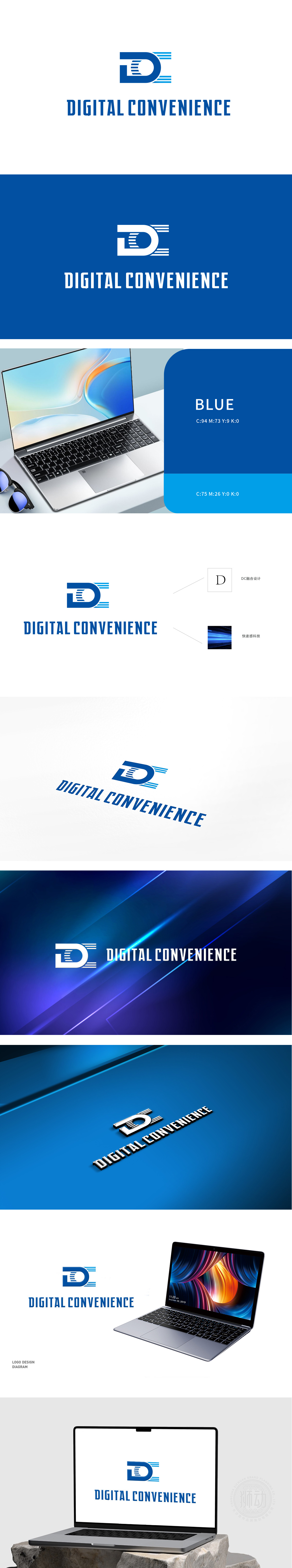
    狮动设计以字母“D”为核心,采用蓝色渐变色块和线条进行装饰,整体设计现代且具有科技感。色彩选择:蓝色象征科技、信任和专业,符合“DIGITAL CONVENIENCE”(数字便捷)的品牌定位。狮动凭借其卓越的设计理念和专业技能,成功将‘数字便捷’的品牌理念融入简洁现代的视觉元素中。

    Lion design takes the letter "D" as the core and is decorated with blue gradient blocks and lines. The overall design is modern and has a sense of science and technology. Color selection: Blue symbolizes technology, trust and professionalism, which conforms to the brand positioning of "Digital Comfort". With its excellent design concept and professional skills.


    digital convenience 电子/家电产品 LOGO设计


    我想要类似的服务 >>

    发表评论(176+)>>


    测试221124测试221124

    T:189 0730 1477

    www.shidong.co

    2016-2022 狮动®长沙思传品牌策划有限公司

    湘ICP备2022023572号-1

    咨询客服

    189 0730 1477

    扫码或拨打添加客服微信

    预约设计

    咨询客服 & 预约设计

    189 0730 1477

    扫码或拨打添加客服微信