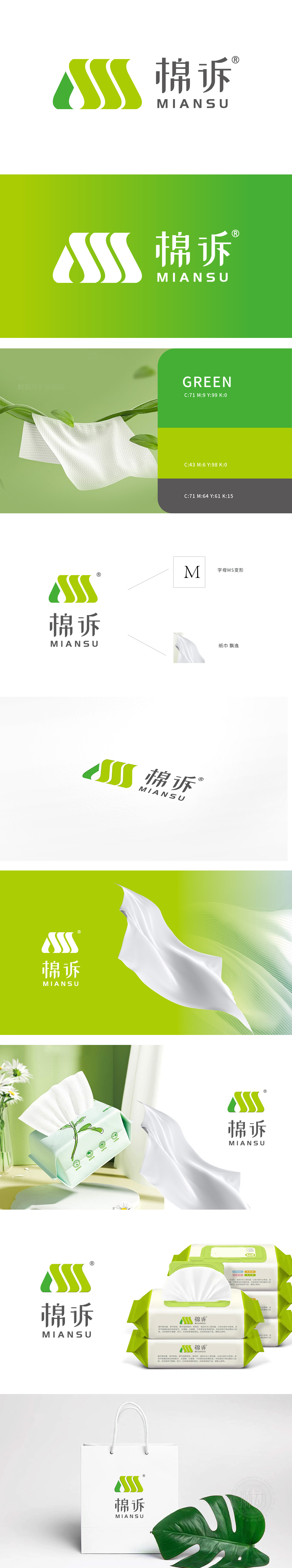
棉诉委托狮动设计的品牌logo,以抽象的渐变绿几何图形为核心,象征自然生长与可持续理念,图形由左至右渐次舒展,传递柔软与生命力。字体选用现代简约风格,与视觉符号形成呼吸感,整体清新自然。狮动通过深入调研棉诉“环保、亲肤”的品牌内核,将理性与感性融合,创造出强记忆点符号,终端应用中有效提升品牌辨识度,让“棉诉”从同质化竞争中脱颖而出,成为消费者心中的“柔软治愈系”首选。
The brand logo designed by Mian v. Lion Motion takes the abstract gradual green geometric figure as the core, symbolizing the concept of natural growth and sustainability, and the figure gradually stretches from left to right, conveying softness and vitality. The font is in modern and simple style, which forms a sense of breathing with visual symbols, and the whole is fresh and natural. Through in-depth research on the brand core of "environmental protection and skin-friendliness", Lion Motion combines rationality and sensibility.


扫码或拨打添加客服微信


