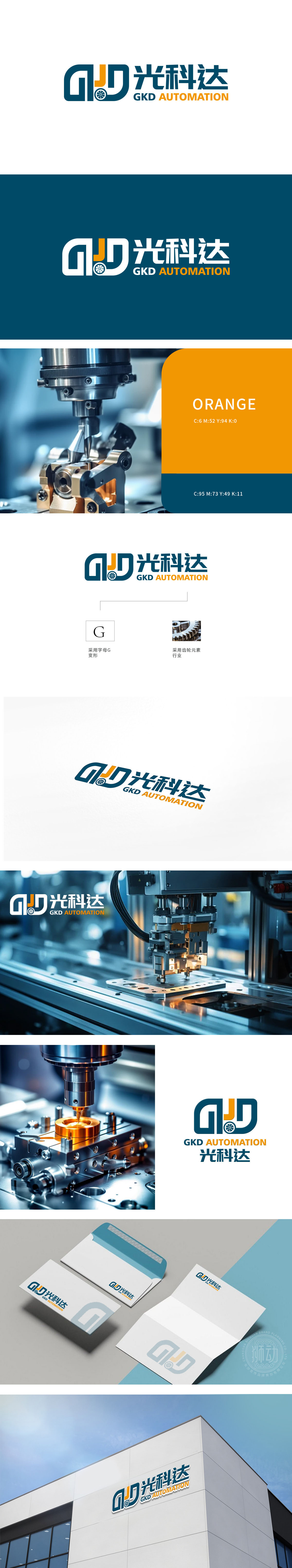
GKD公司委托狮动设计品牌logo,我们深入挖掘其自动化科技定位,以“GKD”字母变形为核心,将“J”与“D”融合齿轮造型,象征精准传动与科技动力。橙色激发创新活力,深蓝传递专业信赖,中英文名称强化国际化形象。整体设计既凝聚品牌核心价值,又具备高度辨识度,助力GKD在市场中脱颖而出。狮动以策略性视觉符号与客户需求精准对接,展现卓越设计实力。
GKD Company commissioned Lion Motion to design the brand logo, and we deeply explored its automation technology positioning. With the letter deformation of GKD as the core, J and D were integrated into gear modeling, symbolizing precision transmission and technological power. Orange inspires innovation, dark blue conveys professional trust, and Chinese and English names strengthen the international image. The overall design not only embodies the core value of the brand, but also has a high degree of recognition, which helps GKD stand out in the market. Lion Motion accurately connects with customers' needs with strategic visual symbols, showing its outstanding design strength.


扫码或拨打添加客服微信


