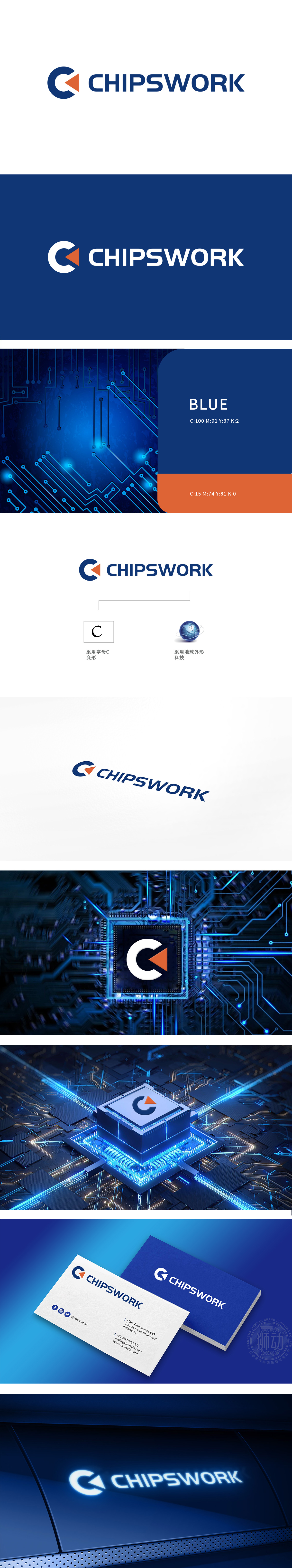
狮动设计采用了字母“C”的变形设计,结合了一个橙色三角形,形成独特的视觉标识。设计简洁而现代,易于识别。Logo通过“C”和地球元素的组合,传达了公司在芯片(Chip)领域中的全球化视野和科技实力。蓝色,代表稳健和专业,整体设计富有层次感,体现了公司的专业化和全球化定位,还提升了品牌在市场中的辨识度和影响力。
Lion movement design adopts the deformation design of the letter "C" and combines an orange triangle to form a unique visual logo. The design is simple and modern, and easy to identify. Logo, through the combination of "C" and earth elements, conveys the company's global vision and scientific and technological strength in the field of Chip. Blue represents stability and professionalism, and the overall design is layered.


扫码或拨打添加客服微信


