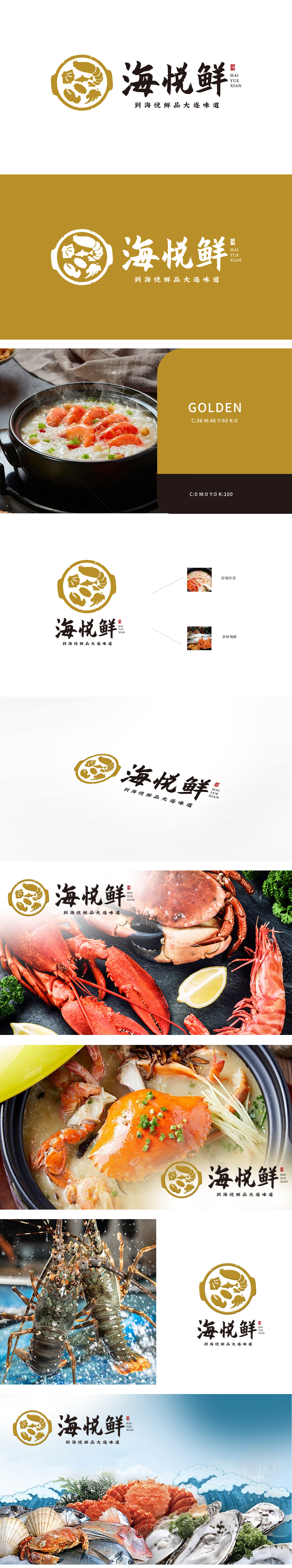
狮动设计采用“砂锅+海鲜”为核心元素,砂锅轮廓传递温暖、工艺感,鲜活的海鲜群像则直指“新鲜”与“品类丰富”,精准呼应“海悦鲜品大连味道”的品牌定位。:金色边框象征品质与地域文化,黑色字体强化专业信赖感,红印章点缀传统底蕴,形成“现代美学×地域特色”的差异化记忆点。狮动通过拆解消费者心智模型(海鲜=新鲜/安全,砂锅=慢炖/营养),将抽象价值转化为具象符号,实现“一眼识别,一秒共鸣”。以符号化叙事,直击品牌核心。
Lion Motion design takes "casserole+seafood" as the core element, the outline of casserole conveys warmth and sense of craftsmanship, and the vivid seafood group image points to "freshness" and "rich variety", which accurately echoes the brand positioning of "Serene Fresh Dalian Taste". The golden border symbolizes quality and regional culture, the black font strengthens the sense of professional trust, and the red seal embellishes the traditional heritage, forming a differentiated memory point of "modern aesthetics × regional characteristics".


扫码或拨打添加客服微信


