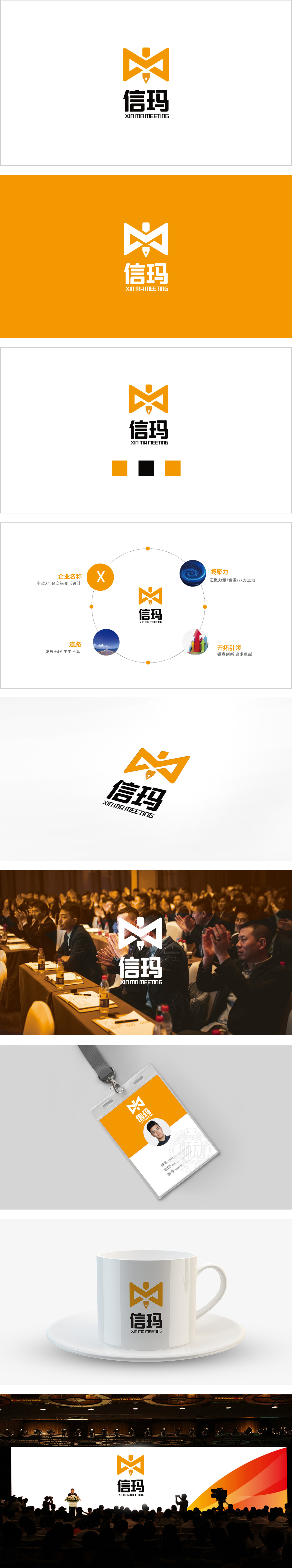
狮动设计以「信玛」核心LOGO为视觉中心,采用X与M的交错变形为核心,简洁现代的几何形态搭配活力橙色,既保留了「服务」的专业感,又传递出「开放、连接」的品牌属性。这种设计既强化了「品牌发展的完整性」(从企业根基到未来开拓的循环提升),又引导视线自然聚焦品牌主体,符合「品牌」需要的「聚焦性」与「包容性」。整体用「具象元素」翻译「抽象价值观」,不仅「好看」,更「有意义」;不仅「视觉化」,更「品牌化」。
Lion Design takes the core LOGO of "Xinma" as the visual center, adopts the staggered deformation of X and M as the core, and the simple and modern geometric form is matched with vibrant orange, which not only retains the professional sense of "service", but also conveys the brand attribute of "openness and connection". This design not only strengthens the "integrity of brand development" (from enterprise foundation to future development), but also guides the line of sight to naturally focus on the main body of the brand, which conforms to the "focus" and "inclusiveness" required by the "brand".


扫码或拨打添加客服微信

