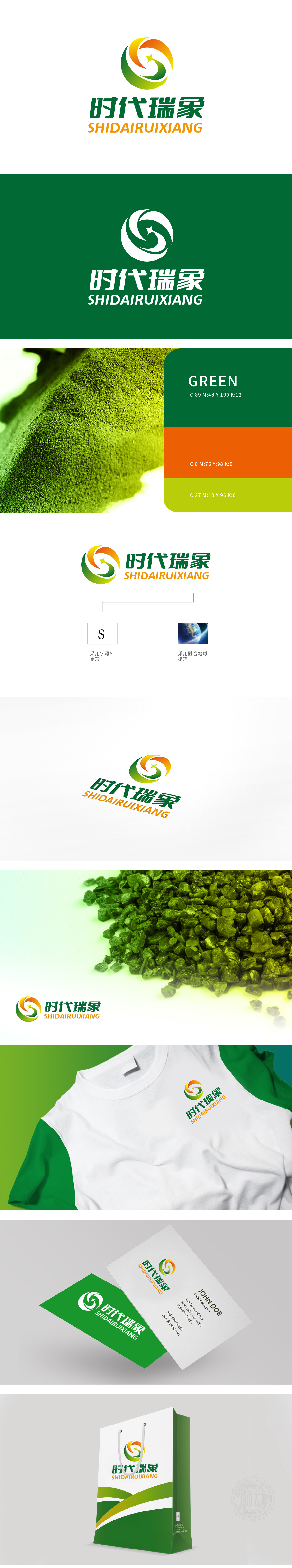
狮动设计以“S”为核心设计元素,巧妙融合品牌名称首字母,强化品牌记忆点。动态流畅的曲线,象征颗粒的微观运动与行业技术的前沿性,传递“精密、活力、创新”的视觉语言。绿色:科技、生态、可靠;黄色:能量、智慧、活力;橙色:创新、进取、信任。三色渐变构建化工行业“技术-环保-未来”的三维价值体系。将抽象的行业前景转化为具象的图形语言,让客户直观感知设计价值。
Lion Motion design adopts "S" as the core design element, skillfully blends the initials of the brand name and strengthens the brand memory. ? The dynamic and smooth curve symbolizes the microscopic movement of particles and the cutting edge of industry technology, and conveys the visual language of "precision, vitality and innovation". Green: technology, ecology and reliability; Yellow: energy, wisdom and vitality; Orange: innovation, enterprising and trust. Three-color gradient to build a three-dimensional value system of "technology-environmental protection-future" in chemical industry.


扫码或拨打添加客服微信


