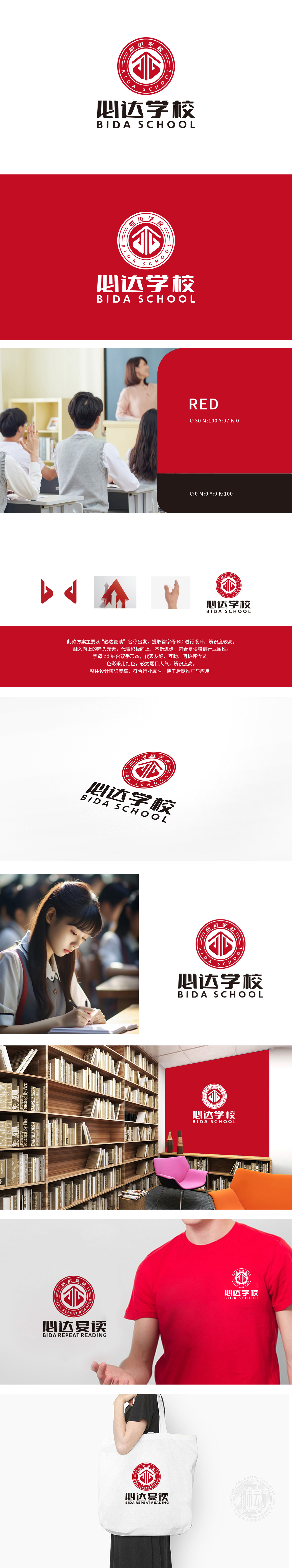
狮动设计将「必达」首字母BD转化为极具辨识度的视觉符号。B字母的圆润结构象征包容与稳定,D的锐利转角传递突破与进取。通过几何切割与空间重构,两个字母在相互支撑中形成动态平衡,暗喻师生共同成长的教育理念。主色选用高饱和度中国红,既是品牌名称「必达」所蕴含的热忱与决心,又精准契合教育行业权威性、激励性的色彩心理学。LOGO负空间的留白智慧,既保持视觉冲击力,又赋予品牌国际化的现代质感。
Lion Motion is designed to transform the initial BD of "Bida" into a highly recognizable visual symbol. The rounded structure of the letter B symbolizes tolerance and stability, and the sharp corner of the letter D conveys breakthrough and enterprising. Through geometric cutting and spatial reconstruction, the two letters form a dynamic balance in mutual support, which is a metaphor for the educational concept of teachers and students growing together. The main color is China Red with high saturation, which is not only the enthusiasm and determination contained in the brand name "Bida", but also the authoritative and inspiring color psychology in the education industry.


扫码或拨打添加客服微信


