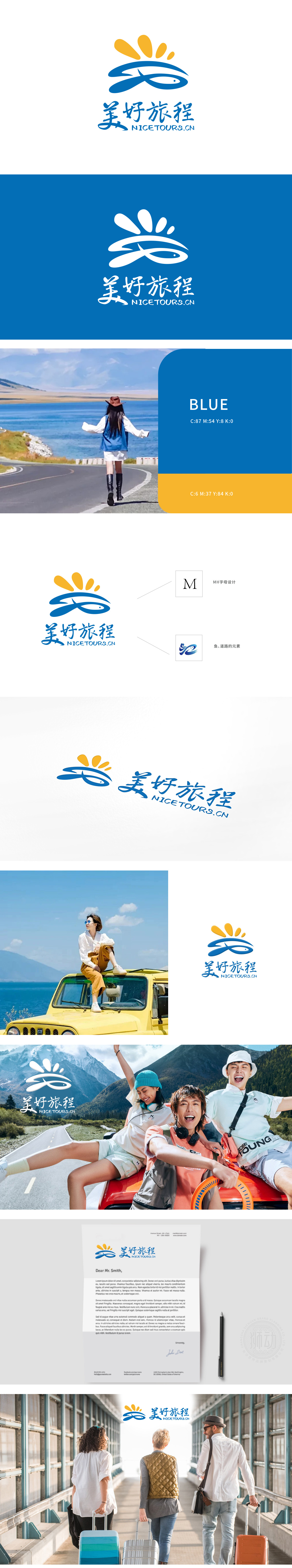
狮动设计以品牌首字母「M」为基石,巧妙融入「H」元素,既强化品牌识别度,又暗含「旅程同行者」的温暖寓意蓝色线条勾勒出鱼的灵动轮廓,尾部自然延伸为蜿蜒道路,直观传递「探索与前行」的旅行精神。鱼象征自由与未知的向往,道路则代表踏实的旅程规划,动静结合,直击旅游行业「安心与惊喜并存」的服务本质。顶部黄色太阳放射状设计,传递温暖、活力与希望,搭配深邃的海洋蓝,形成视觉张力。整体LOGO既唤醒消费者对旅行的愉悦期待,又塑造品牌值得信赖的专业形象。用动态线条引导视觉流动,模拟旅程的沉浸感;
Lion design is based on the brand initials "M" and ingeniously incorporates the "H" element, which not only strengthens the brand recognition, but also implies the warmth of "travelers on the journey". The blue lines outline the smart outline of the fish, and the tail naturally extends into a winding road, intuitively conveying the travel spirit of "exploring and moving forward". Fish symbolizes the yearning for freedom and the unknown, while the road represents the practical journey planning and the combination of dynamic and static, which directly hits the service essence of "peace of mind and surprise coexist" in the tourism industry. The radial design of yellow sun at the top conveys warmth, vitality and hope, and with deep ocean blue, it forms visual tension.


扫码或拨打添加客服微信


