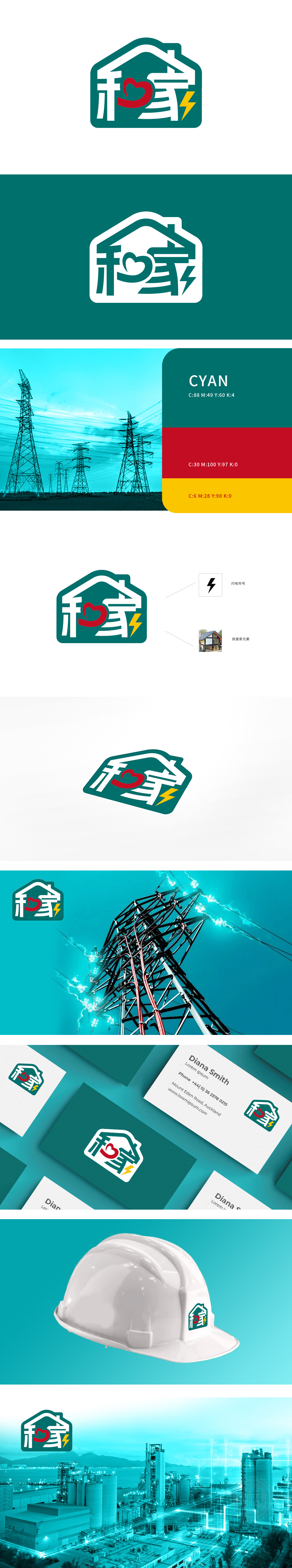
狮动设计以「电力与图形分析」为核心理念,为客户打造这枚深具战略意义的品牌logo——以闪电符号点燃行业动能,以房屋家元素构筑情感归属,红心点缀其间传递温暖承诺。Logo的外形采用了房屋的轮廓,象征着家庭和安居的概念,传达出温馨和安全的感觉。闪电符号:Logo中包含一个黄色的闪电符号,象征电力或能源,整体设计简洁而富有象征意义,房屋轮廓与心形的结合,既体现了家庭的温馨,又突出了品牌的人文关怀。
Lion Motion Design takes "power and graphic analysis" as the core concept, and creates this brand logo—— with strategic significance for customers-lighting the kinetic energy of the industry with lightning symbols, building emotional closeness with house elements, and conveying warm promises with red hearts. The Logo adopts the outline of the house, symbolizing the concept of family and living in peace, and conveying the feeling of warmth and security.Lightning symbol: the Logo contains a yellow lightning symbol, which symbolizes electricity or energy.


扫码或拨打添加客服微信


