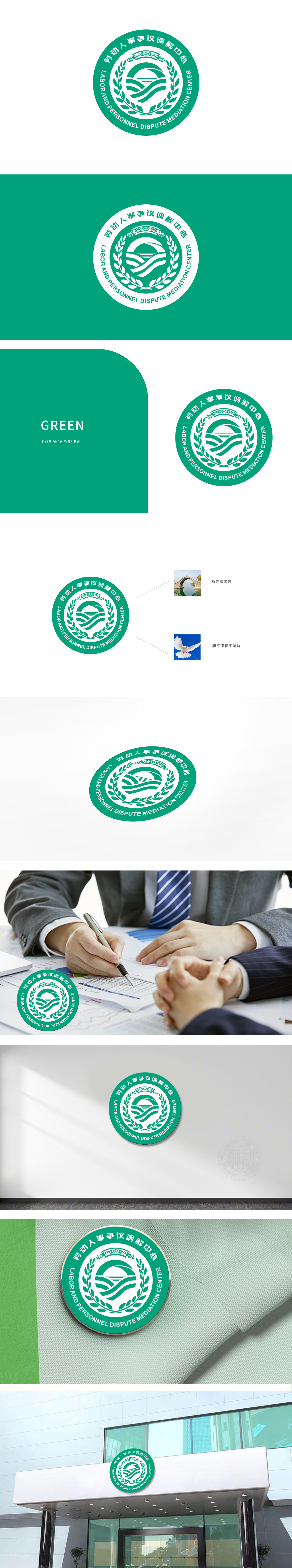
狮动设计将圆形作为基础框架,象征“圆满解决”与“包容性”,契合调解中心的和谐定位。桥梁图形:抽象化桥梁造型与波浪线条组合,直观诠释“连接沟通”的核心功能,暗示争议双方通过调解达成理解与共赢。两侧点缀象征和平与希望的橄榄枝,呼应“和平调解”的理念,增强视觉亲和力。标志兼顾美观与信息承载,实景元素补充场景联想,满足品牌传播的多维度需求。
Lion movement design takes the circle as the basic framework, symbolizing "satisfactory solution" and "inclusiveness", which is in line with the harmonious positioning of the mediation center. Bridge graphics: abstract the combination of bridge modeling and wavy lines, intuitively interpret the core function of "connecting and communicating", and imply that both parties to the dispute can reach understanding and win-win through mediation. Both sides are decorated with olive branches symbolizing peace and hope.


扫码或拨打添加客服微信


