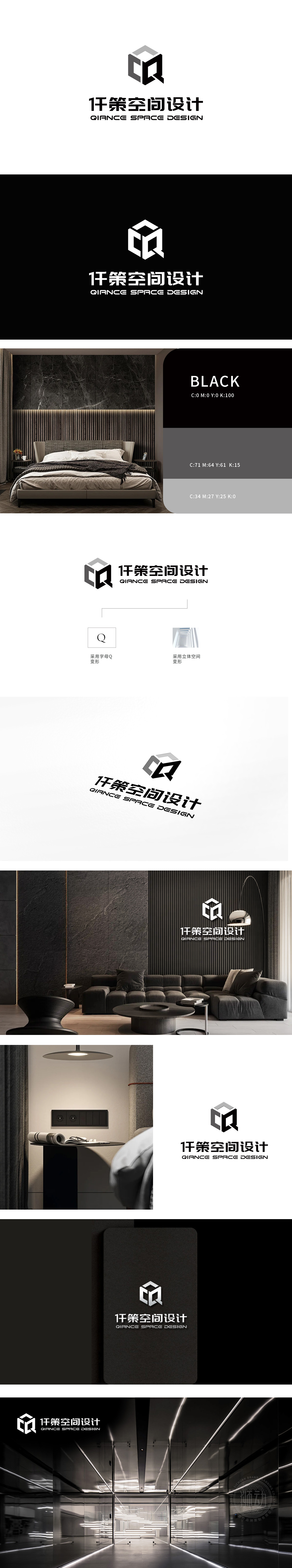
狮动设计采用了Logo左侧采用字母“Q”进行变形设计,简洁而富有现代感,体现了公司的品牌标识性。立体空间的变形设计,直观展现了空间设计的专业性和创意性,象征着公司致力于打造独特、立体的空间解决方案。狮动设计以「图形解构+空间重构」的双维策略,为公司打造了极具辨识度的仟策空间设计LOGO。从字母「Q」的立体裂变到空间结构的动态平衡,每一处设计细节都是对品牌「空间美学」的深度诠释。
Lion design uses the letter "Q" on the left side of the Logo for deformation design, which is concise and modern, and reflects the brand identity of the company. The deformation design of three-dimensional space intuitively shows the professionalism and creativity of space design, which symbolizes the company's commitment to creating unique and three-dimensional space solutions. Lion Motion Design has created a highly recognizable spatial design LOGO for the company with the two-dimensional strategy of "graphic deconstruction+spatial reconstruction".


扫码或拨打添加客服微信


