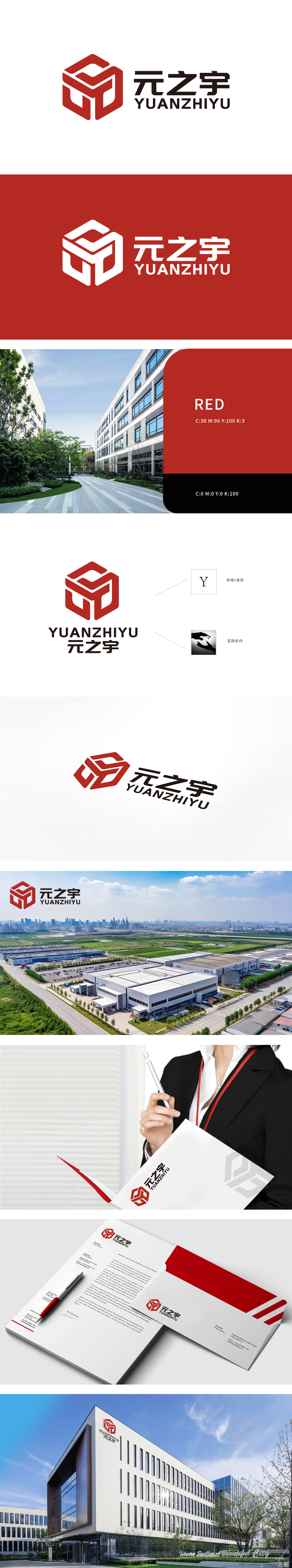
狮动设计采用了字母“Y”的变形,象征着公司的首字母。红色立体几何图形构成同时,图形中类似双手相握的元素,巧妙地融入了“互助合作”的理念,传达出团队协作与伙伴关系的重要性。整体设计以“元之宇”品牌核心价值为原点,通过几何美学与空间逻辑的精准解构,将厂房园区的功能属性、合作理念及企业精神转化为极具辨识度的视觉语言。
Lion design adopts the variation of the letter "Y", which symbolizes the company's initials. At the same time, the red three-dimensional geometric figure is composed of elements similar to hands clasping, which skillfully integrates the concept of "mutual assistance and cooperation" and conveys the importance of teamwork and partnership. The overall design takes the core value of "Yuan Zhiyu" brand as the origin, and through the precise deconstruction of geometric aesthetics and spatial logic, the functional attributes, cooperation concept and enterprise spirit of the factory park are transformed into highly recognizable visual language.


扫码或拨打添加客服微信


