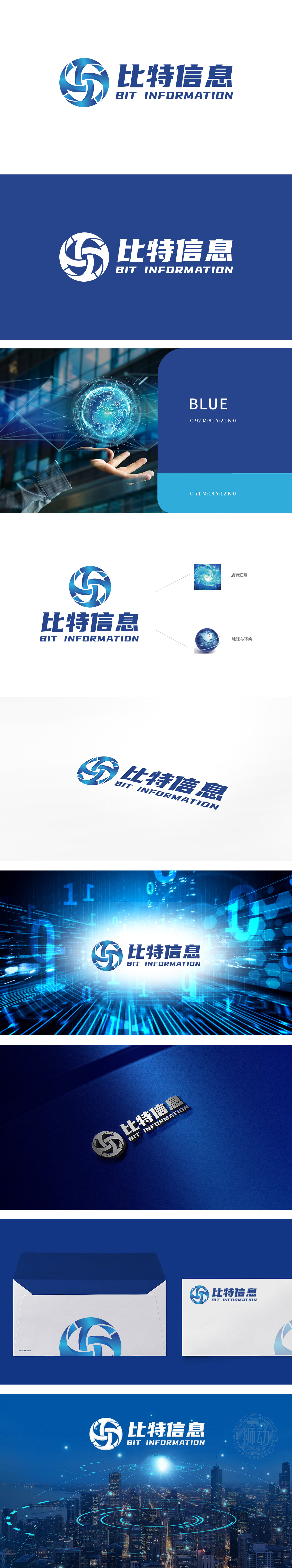
狮动设计以采用蓝色调,图形设计类似旋转的风车或数据流,象征信息的流动与汇聚。“旋转汇聚”:右侧的螺旋状图案,象征信息的集中与整合,可能暗示数据的高速流转与汇聚,与“超光速现象”的高速传输概念有异曲同工之妙。“地球与环绕”:地球图案配以环绕线条,象征全球化信息网络,体现公司业务的国际视野和广泛连接。整体设计巧妙融入了“信息高速流转”与“全球化网络”的理念,展现了公司在信息处理与传输领域的专业性和前瞻性。
Lion design adopts blue tone, and the graphic design is similar to a spinning windmill or data stream, symbolizing the flow and convergence of information. "Rotating convergence": the spiral pattern on the right symbolizes the concentration and integration of information, which may imply the high-speed flow and convergence of data, which is similar to the concept of high-speed transmission of "superluminal phenomenon". "Earth and Surrounding": The earth pattern with surrounding lines symbolizes the global information network and reflects the international vision and extensive connection of the company's business.


扫码或拨打添加客服微信


