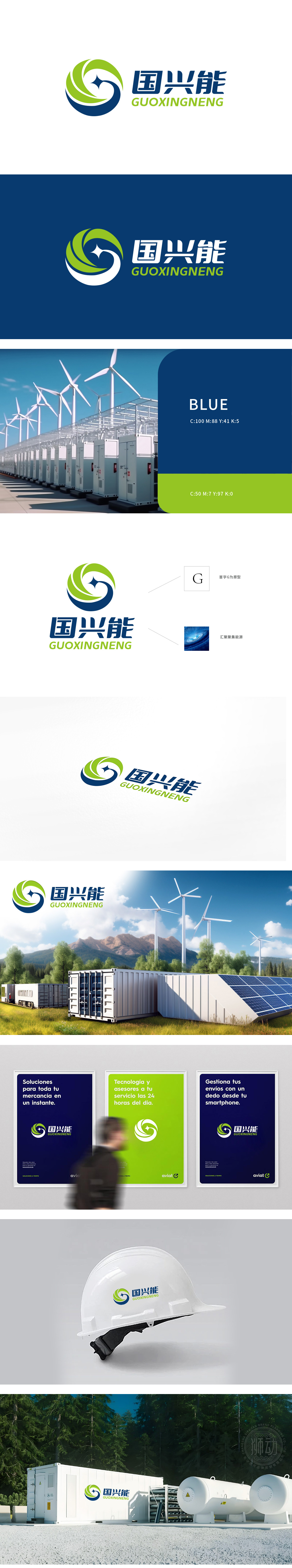
狮动设计以字母G变形设计,突出品牌,融入螺旋状设计:形似风车或涡旋,不仅体现了动感和能量的汇聚,还隐喻了太阳能的捕捉与转化过程。中心亮点:类似太阳光芒的点缀,直接关联太阳能的核心概念,象征光明和能量的源泉。整体设计不驻潮流配色、还具备高度的辨识度和艺术美感。
Lion design is designed with the letter G, which highlights the brand and blends into the spiral design: it looks like a windmill or vortex, which not only reflects the dynamic and energy convergence, but also metaphors the capture and transformation process of solar energy. Central highlight: similar to the embellishment of the sun's rays, it is directly related to the core concept of solar energy and symbolizes the source of light and energy.


扫码或拨打添加客服微信


