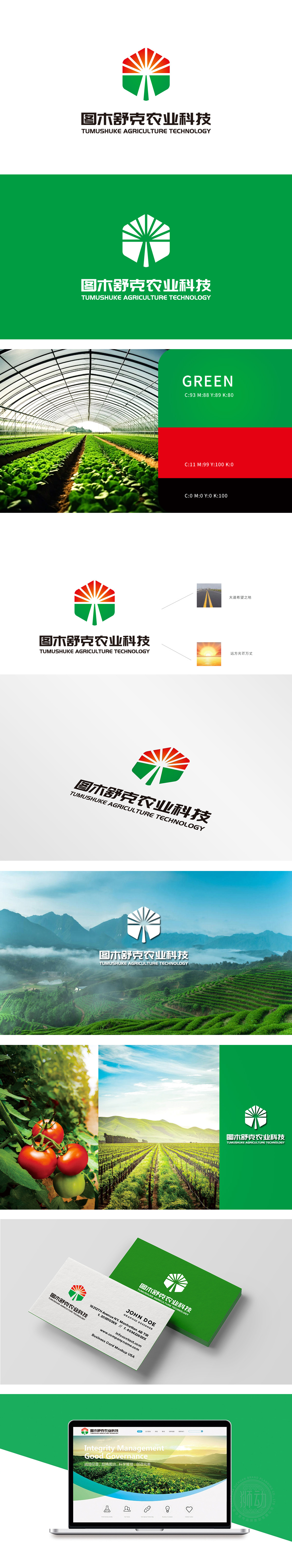
狮动设计采用了logo顶部扇形红橙渐变,模拟朝阳破晓的弧度,象征农业对光能的永恒依赖与丰收的希望。双叶造型抽象自作物生长形态,绿色层叠寓意生态循环与丰饶。中央白色脊线隐喻现代农业的精准灌溉脉络,将自然生机与科技效率融为一体。整体设计不仅是一个符号,更是农业科技与大地精神的视觉叙事。
Lion t design adopts a fan-shaped red-orange gradient at the top of the logo, which simulates the radian of the dawn of the morning sun and symbolizes the eternal dependence of agriculture on light energy and the hope of bumper harvest. Shuang Ye's modeling is abstracted from the growth form of crops, and green layering implies ecological cycle and abundance. The central white ridge line symbolizes the precise irrigation vein of modern agriculture, and integrates natural vitality with scientific and technological efficiency.


扫码或拨打添加客服微信


