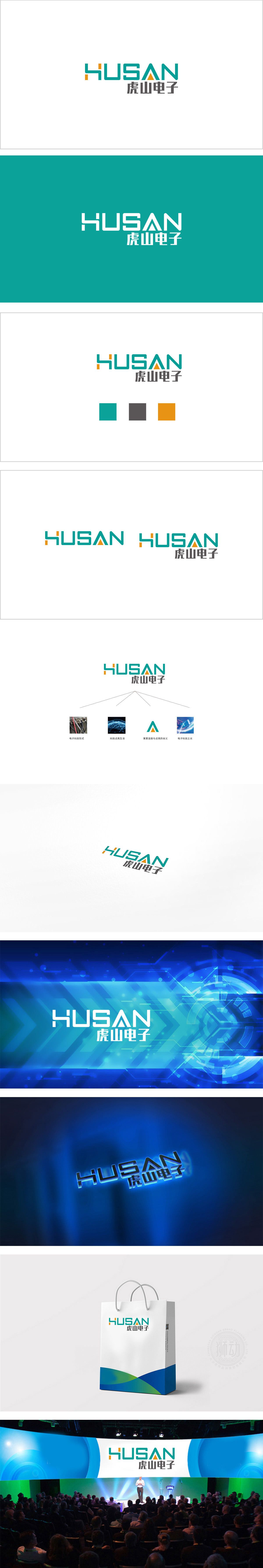
狮动设计采用极简语言讲电子故事,字母“H”采用了线条化的抽象处理,像电子电路中的连接端子,又似信号传递的箭头,直接关联电子科技的“连接”本质;字母“S”中间嵌入了一个橙色三角形,既是“亮点”的视觉符号,又呼应了电子元件中“芯片”“模块”的棱角感,传递出“科技内核”的坚实感。色彩搭配:主体采用青绿色(科技、专业、冷静),搭配橙色(活力、创新、醒目),增添了“创新驱动”的活力,两者结合既符合行业属性,又能快速抓住视觉注意力。整体用“抽象的连接”“具象的生活”“符号化的亮点”等元素,把电子科技的“专业、价值、未来”转化为可感知的视觉语言。
Lion design uses minimalist language to tell electronic stories, and the letter "H" adopts linear abstract treatment, which is like a connecting terminal in an electronic circuit and an arrow for signal transmission, directly related to the "connection" essence of electronic technology. An orange triangle is embedded in the middle of the letter "S", which is not only the visual symbol of "bright spot", but also echoes the angular sense of "chip" and "module" in electronic components, and conveys the solid sense of "technology core". Color matching: The main body adopts turquoise (technical, professional and calm) and orange (energetic, innovative and eye-catching).


扫码或拨打添加客服微信


