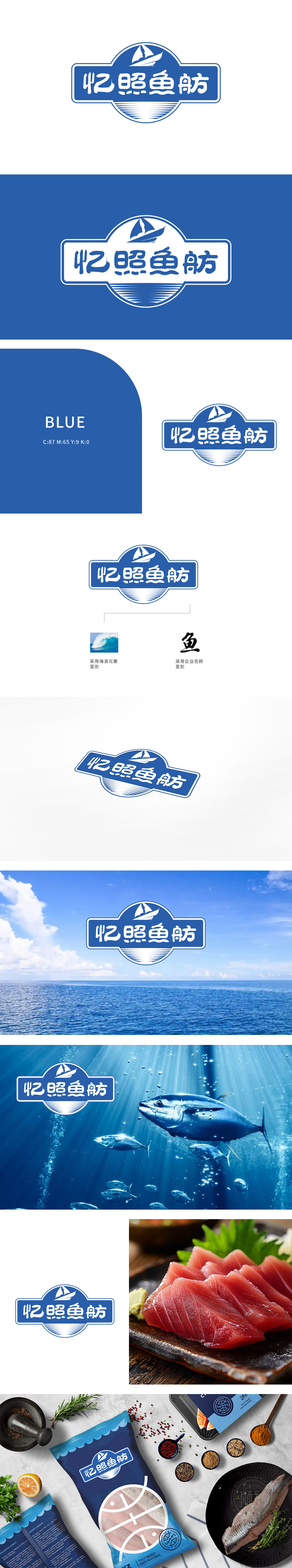
狮动设计采用企业名称变形设计,增添了文化韵味和艺术感。左侧采用海浪元素变形,象征海洋主题,体现产品的鲜活,同时又寓意企业在商业大潮中,乘风破浪,勇往直前。底部元素字体设计简洁有力,易于阅读。色彩搭配:蓝色调符合海洋主题,给人以清新、专业的感觉。整体设计主题鲜明、创意独特,充分展现了狮动的设计能力和专业水平。
Lion design adopts the name deformation design of the enterprise, which adds cultural charm and artistic sense. The left side adopts wave element deformation, symbolizing the theme of the ocean, reflecting the vividness of products, and at the same time implying that enterprises are brave in the tide of business. The bottom element font design is concise and powerful, and easy to read. Color matching: the blue tone conforms to the marine theme, giving people a fresh and professional feeling. The overall design has a distinctive theme and unique creativity.


扫码或拨打添加客服微信


