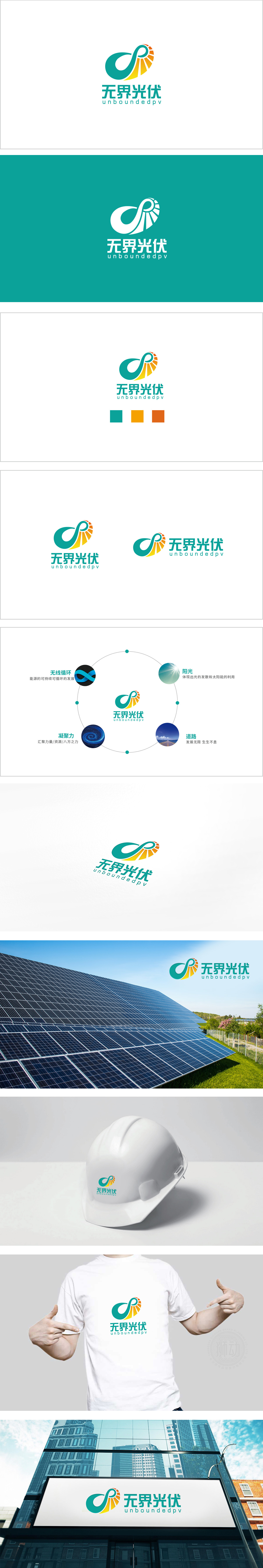
狮动设计通过抽象符号+具象意象的组合,直接传递“光伏”与“无界”的核心属性:主体是一个变形的无穷大(∞)符号——流畅的绿色曲线融合了黄色放射状阳光。这种设计将“无界”的抽象概念转化为可视化的“无限循环”符号,同时用“阳光”具象点出光伏产业的本质。颜色寓意: 绿色代表“环保、可持续”,黄色代表“阳光、活力”,两者搭配清新且有科技感,符合现代新能源品牌的视觉调性。将四个关键元素(无线循环、阳光、道路、凝聚力)串联成一个有机循环系统,这四个元素像四颗“能量球”,被环形虚线串成一个有机的生态系统,每一环都在说:光伏不是孤立的技术,而是“从阳光到未来”的完整闭环。
Lion design directly conveys the core attributes of "photovoltaic" and "unbounded" through the combination of abstract symbols and concrete images: the subject is a deformed infinite (∞) symbol-the smooth green curve blends with yellow radial sunlight. This design transforms the abstract concept of "unbounded" into a visual symbol of "infinite cycle", and at the same time points out the essence of photovoltaic industry with "sunshine". Moral of color: green stands for "environmental protection and sustainability" and yellow stands for "sunshine and vitality". The combination of the two is fresh and scientific, which conforms to the visual tonality of modern new energy brands.


扫码或拨打添加客服微信


