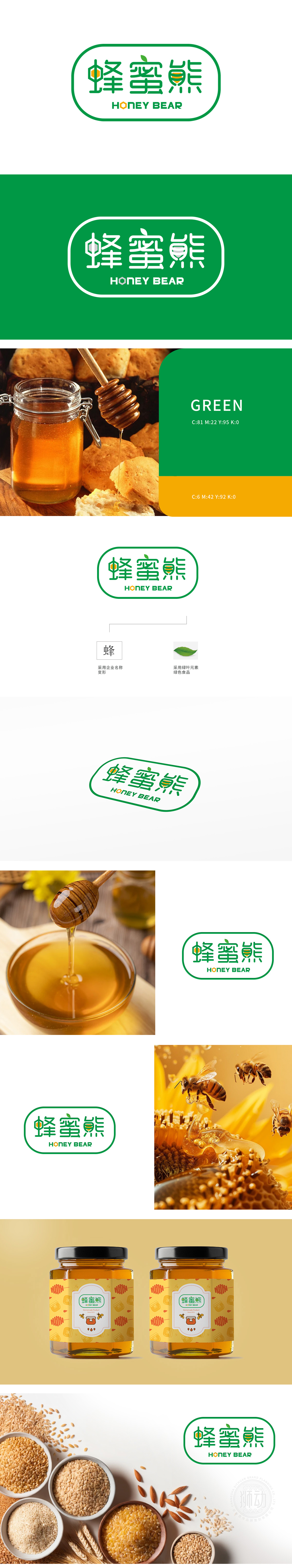
狮动设计以左侧“蜂”字采用篆书笔触的简化变形,保留汉字结构的同时,将下方“虫”部演化为抽象的“蜜蜂腹部”——橙色圆点与条纹细节(黄色线条)直接对应蜂蜜的视觉符号,既符合中式文字“观物取象”的造字逻辑(通过形态联想事物本质),又直观传递“蜂蜜”核心产品属性。设计通过字象形变形、自然符号提取、传统色彩意向三大中式设计手法,将“蜂蜜熊”的品牌名称、产品属性(蜂蜜、绿色食品)与文化内涵(自然、健康、传统信任感)深度融合。符合中式美学“留白”“写意”的特点。
Lion Design adopts the simplified deformation of the left-hand character "bee" with the strokes of seal script, while retaining the structure of Chinese characters, it evolves the lower part of "insect" into an abstract "bee belly" —— orange dots and striped details (yellow lines) directly correspond to the visual symbols of honey, which not only conforms to the word-making logic of Chinese characters "observing things and taking images" (associating the essence of things through the form), but also intuitively conveys the attributes of the core product of "honey".


扫码或拨打添加客服微信


