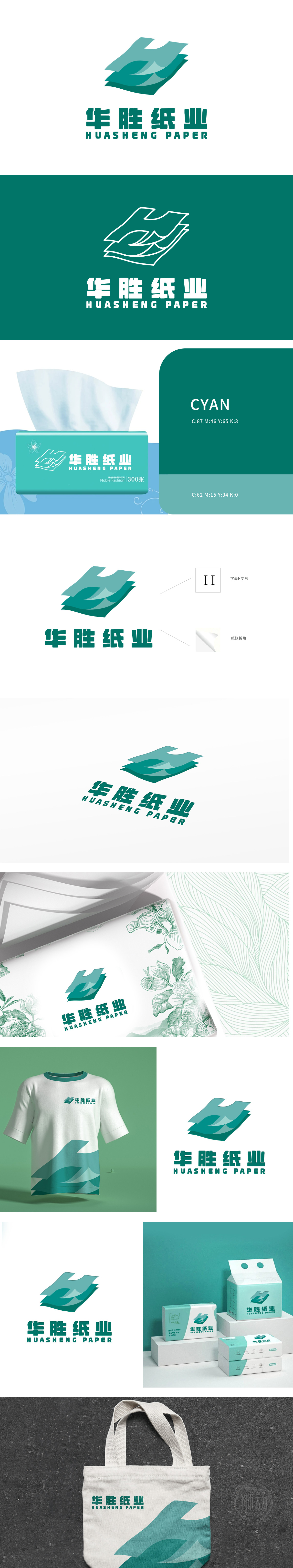
狮动设计以“字母H变形”与“纸张折角”为创意原点,将抽象概念转化为极具辨识度的视觉符号——标志中波浪形线条巧妙构成变体“H”,既呼应品牌名称“华胜”的首字母,又通过深浅渐变的绿色赋予纸张流动质感;而纸角掀起的动态设计,则直观呈现纸业行业的特性,让简洁的几何图形瞬间充满行业张力。整体设计“以抽象提炼本质,用细节传递价值”的理念,将具体设计元素升华为设计哲学。
Lion design takes "letter H deformation" and "paper folding angle" as the creative origin. Lion Motion transforms abstract concepts into highly recognizable visual symbols-the wavy lines in the logo skillfully form the variant "H", which not only echoes the initials of the brand name "Huasheng", but also gives the paper a flowing texture through the gradual green color. The dynamic design of paper angle lifting presents the characteristics of paper industry intuitively, making simple geometric figures full of industry tension instantly.


扫码或拨打添加客服微信


