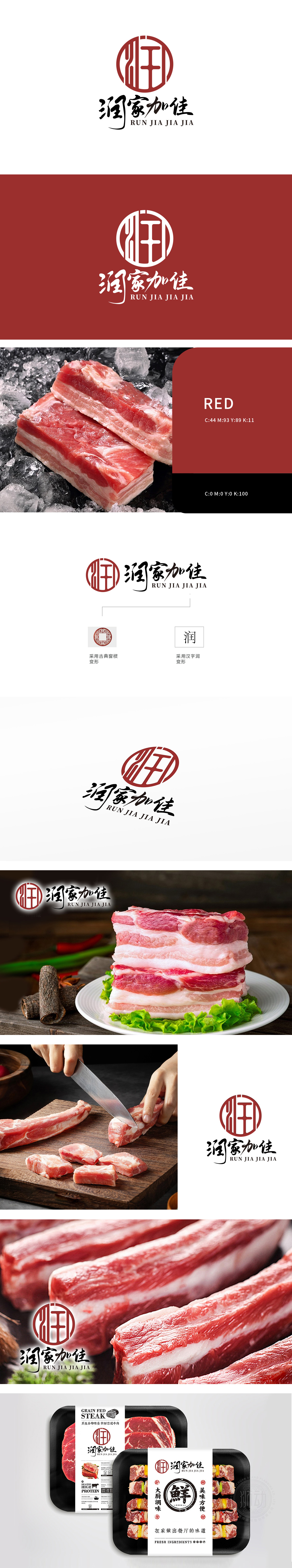
狮动设计融入古典窗棂变形设计,红色圆形图案内嵌传统窗格纹样,体现古典美学,象征稳固与传承。使用汉字“润”进行变形设计,搭配“润家加佳”四个字,字体流畅,富有艺术感,传达公司名称与理念。但可通过“润”字的润泽之意,联想到冷鲜肉的鲜嫩多汁,传递产品的新鲜与高品质。整体设计将‘润家加佳’的温暖质感与冷鲜肉的鲜活生命力巧妙凝结,让每一次视觉接触都成为品牌故事的生动演绎。
Lion design adopts the classical window lattice deformation design, and the red circular pattern is embedded with the traditional pane pattern, which embodies the classical aesthetics and symbolizes stability and inheritance. The Chinese character "Run" is used for deformation design, and with the words "Run Jia Jia Jia", the font is smooth and artistic, conveying the company name and concept. However, through the moist meaning of the word "run", it can be associated with the freshness and juiciness of cold meat and convey the freshness and high quality of products.


扫码或拨打添加客服微信


