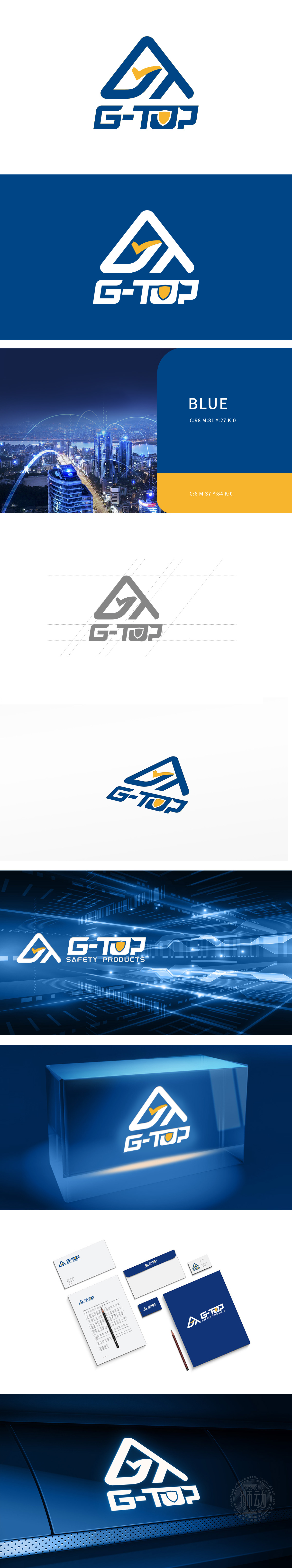
狮动设计采用了一个抽象的三角形结构,内部嵌入一个黄色的箭头形状,整体设计简洁而现代。颜色选择:深蓝色和黄色的搭配,蓝色象征科技、稳定和专业,黄色则代表创新和活力。三角形的稳定结构和箭头的动感结合,传达出科技领域的稳健与前瞻特性,代表公司在科技领域的专业性和创新力。该logo设计简洁明了,色彩搭配合理,有效传达了科技公司的专业形象和创新精神。
Lion design adopts an abstract triangular structure with a yellow arrow shape embedded inside, and the overall design is simple and modern. Color choice: the combination of dark blue and yellow, blue symbolizes technology, stability and professionalism, and yellow represents innovation and vitality. The stable structure of triangle and the dynamic combination of arrows convey the stable and forward-looking characteristics in the field of science and technology, suggesting the company's professionalism and innovation in the field of science and technology.


扫码或拨打添加客服微信


