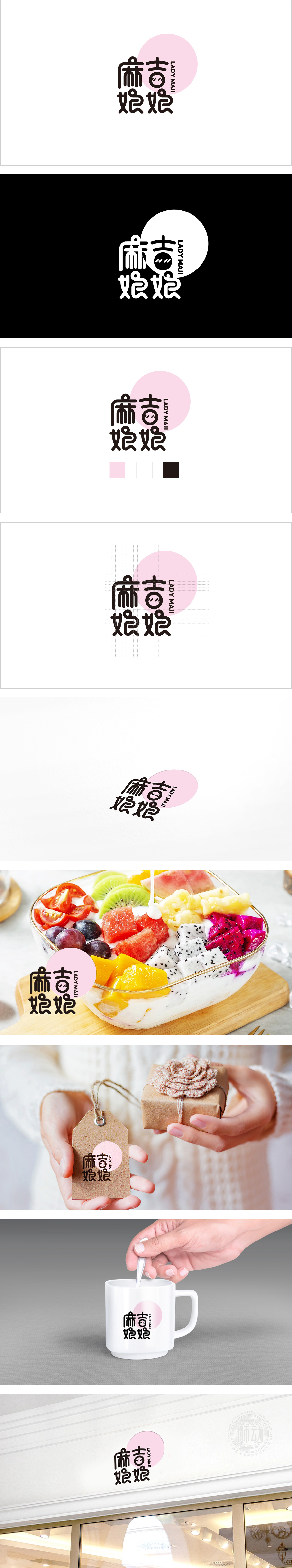
狮动设计用卡通化、拟人化、简洁可爱的字体风格,笔画圆润,曲线感强:多用柔和曲线,笔画末端带轻微弧度,类似水果的圆润形态,传递“柔软、甜美”的直觉感受,符合水果捞“细腻口感”的联想。拟人化装饰,增强亲和力: “吉”字内部的两点被设计成拟人化眼睛,赋予字体“生命力”,仿佛一个活泼的“小角色”,打破常规字体的冰冷感,更符合水果捞“亲切、治愈”的品牌调性。整体简洁易读,同时通过“吉”字的眼睛设计形成独特记忆点,便于品牌识别。
Lion design uses cartoon, personification, simple and lovely font style, with round strokes and strong sense of curve: soft curves are used, and the ends of strokes are slightly curved, which is similar to the round shape of fruits, conveying the intuitive feeling of "softness and sweetness" and conforming to the association of "delicate taste" of fruit fishing.Humanized decoration and enhanced affinity: The two points inside the word "Ji" are designed as anthropomorphic eyes, giving the font "vitality", like a lively "small role", breaking the cold feeling of conventional fonts.


扫码或拨打添加客服微信


