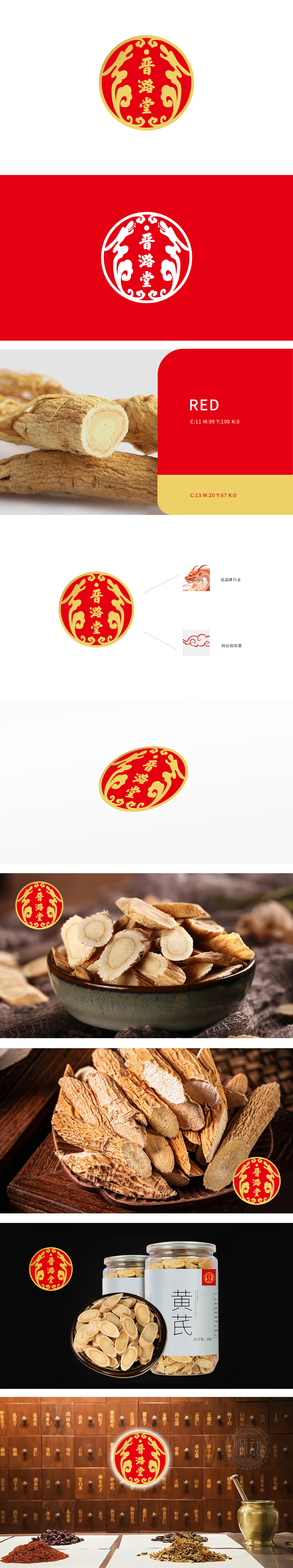
狮动设计采用经典的圆形设计,象征圆满和和谐,给人以稳定和可靠的感觉。红黄配色:红色代表热情、活力和好运,黄色象征尊贵和财富,二者结合传递出积极向上和高端的品牌形象。“晋潞堂”字样:位于Logo中央,字体庄重典雅,彰显品牌的历史底蕴和文化内龙图案:两侧的龙形图案,象征力量、尊贵和吉祥,与“龙品牌行业”相呼应,突出品牌的行业地位和独特魅力。祥云和如意图案:底部的祥云和如意元素,寓意吉祥如意、事事顺心,增强品牌的亲和力和美好愿景。整体设计呈现出一幅千年药材的智慧遇上现代设计的笔触,一场视觉与文化的盛宴就此拉开画卷。
Lion design adopts classic circular design, which symbolizes perfection and harmony, giving people a sense of stability and reliability. Red and yellow color matching: red represents enthusiasm, vitality and good luck, and yellow symbolizes dignity and wealth. The combination of the two conveys a positive and high-end brand image. The word "Jinlutang": located in the center of the Logo, the font is solemn and elegant, which shows the historical background and dragon pattern in the culture of the brand. The dragon patterns on both sides symbolize strength, dignity and auspiciousness, which echoes the "Dragon Brand Industry" and highlights the industry position and unique charm of the brand.


扫码或拨打添加客服微信


