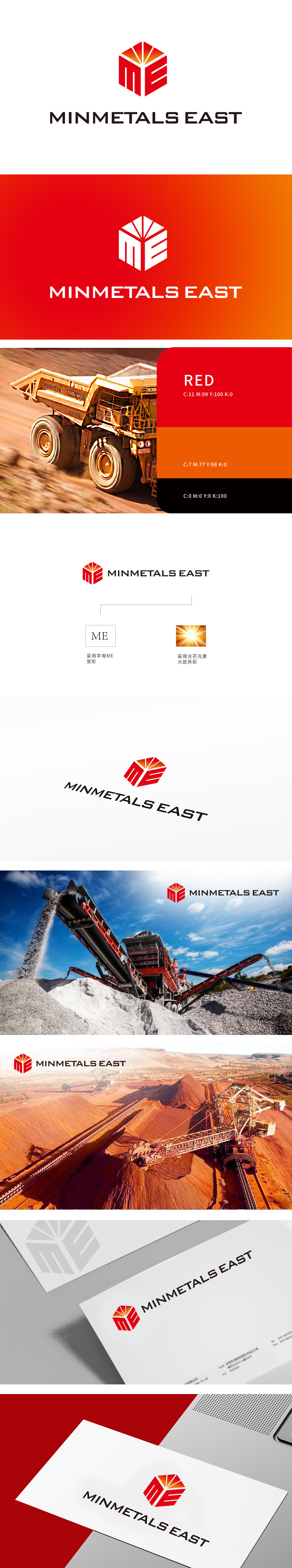
狮动设计采用字母ME立体变形:简洁明了,易于识别,象征公司品牌的核心元素。融入光芒元素大放异彩:象征光明与希望,传达公司积极向上的企业精神,整体设计将身矿采沙领域的坚实棱角,与光芒元素将现场的炽热与璀璨凝固为永恒的品牌符号。狮动以现代设计语言重新诠释地域品牌价值,为客户创造可触摸、可传播、可记忆的商业符号。
Lion design adopts the letter ME three-dimensional deformation: concise and easy to identify, symbolizing the core elements of the company brand. Blending the light elements to shine brilliantly: symbolizing light and hope, conveying the company's positive entrepreneurial spirit, the overall design will solidify the solid edges and corners in the field of mining and sand mining, and the light elements will solidify the fiery and bright scene into an eternal brand symbol.


扫码或拨打添加客服微信


