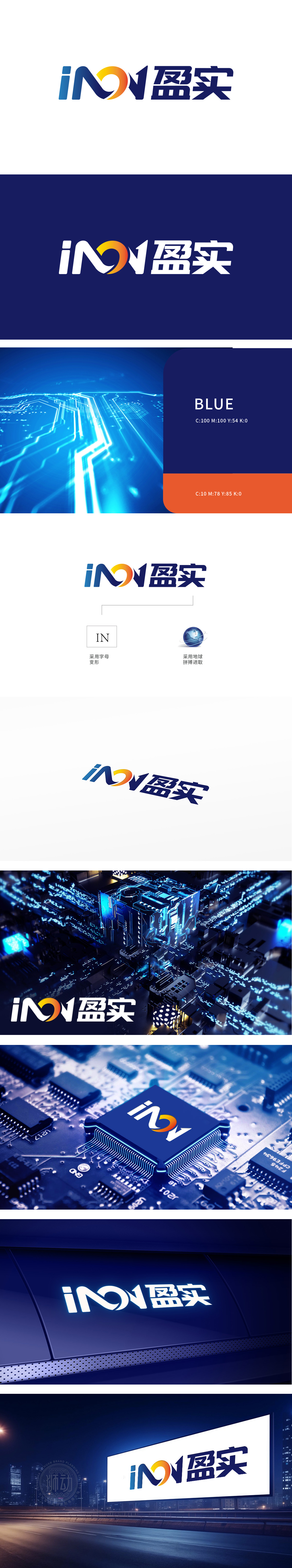
狮动设计由“iN”和“盈实”两部分组成,采用字母变形与地球元素相结合的设计手法,展现出企业的国际化视野和稳健发展的理念。“iN”部分:iN”采用字母变形设计,简洁明了,象征着创新Innovation)与网络(Network)的结合,体现了公司在信息技术或网络领域的专业性和前瞻性。“盈实”部分:“盈实”二字采用稳重的蓝色字体,传达出企业的可靠性和实质性,当品牌标识的每一笔划都成为战略的密码,当色彩与形态共同诉说企业的雄心,这便是狮动设计打造的「iN盈实」LOGO所展现的魔力.
Lion design consists of two parts: "iN" and "Ying Shi". It adopts the design method of combining letter deformation with earth elements to show the international vision and the concept of steady development of the enterprise."iN" part: iN is designed with letter deformation, which is concise and clear, symbolizes the combination of Innovation and Network, and embodies the professionalism and foresight of the company in the field of information technology or network. "Yingshi" part: The word "Yingshi" adopts a steady blue font, which conveys the reliability and substance of the enterprise.


扫码或拨打添加客服微信


