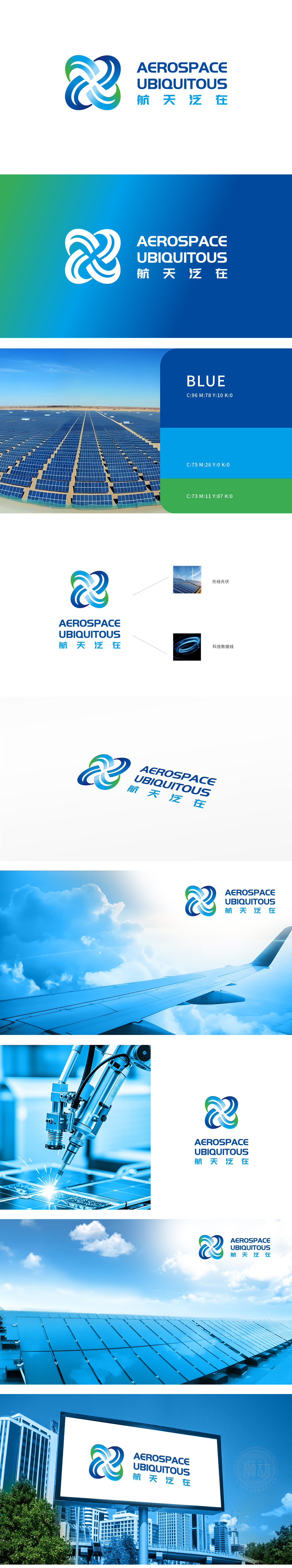
狮动设计采用四个相互交织的弧形组成,形成一个动态的环状结构,象征着连接与融合,使用了蓝绿渐变色,蓝色代表科技与专业,绿色象征环保与创新,整体传达出高科技与可持续发展的理念。交织的弧形设计寓意着航空航天领域的广泛连接与无处不在,整体如同卫星轨道的交织网络,既象征航天技术的互联与泛在覆盖,又通过动态渐变传递出星际航道的深邃与科技脉动的生命力。
Lion design Logo is composed of four intertwined arcs, forming a dynamic ring structure, symbolizing connection and integration. It uses blue-green gradient color, blue represents technology and specialty, green symbolizes environmental protection and innovation, and conveys the concept of high-tech and sustainable development as a whole. The interwoven arc design symbolizes the extensive connection and ubiquity in the aerospace field. As a whole, it is like an interwoven network of satellite orbits.


扫码或拨打添加客服微信


